Schumacher
ZANZIBAR TRELLIS – Schumacher Wallpaper
ZANZIBAR TRELLIS – Schumacher Wallpaper
Design story
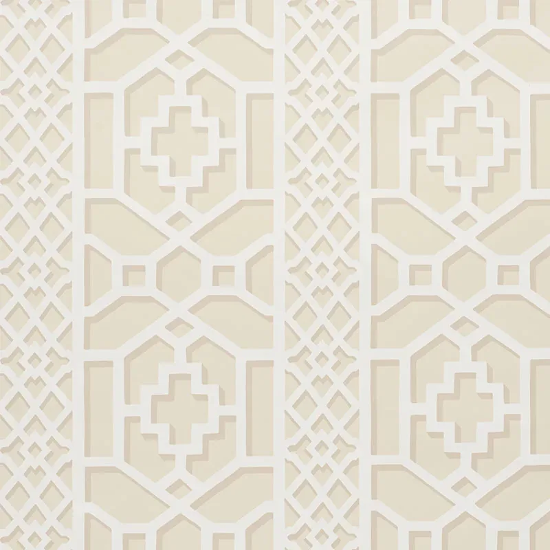
ZANZIBAR TRELLIS by Schumacher Wallpaper channels a refined mid-century modern mood inspired by the iconic trellised rooms of Elsie de Wolfe. Originating in the 1970s and reimagined with a contemporary graphic edge, this pattern evokes a timeless yet fresh atmosphere perfect for today’s interiors.
The beauty of this design lies in its intricate fretwork motif—an elegant lattice of geometric shapes and crosses that create a rhythmic movement across the wall. The pattern balances scale and negative space skillfully, allowing the eye to travel seamlessly while maintaining a structured symmetry that feels both deliberate and airy.
Rendered in the soft, neutral Sand colorway, this wallpaper plays beautifully with light throughout the day. In natural daylight, the beige tones appear warm and inviting, while in the evening, subtle variations in sheen reveal a gentle depth and texture that elevate the room’s ambiance.
What you’re seeing
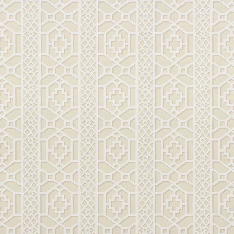
This wallpaper features a beige geometric lattice pattern with symmetrical fretwork and cross motifs in varying shades of sand. The design’s clean lines and balanced repetition create a sense of order and calm. The surface exhibits a subtle texture that catches light differently depending on the angle, enhancing the dimensionality of the pattern without overpowering the space.
There is no metallic or embossed finish; instead, the strength of the design comes from its graphic clarity and the nuanced layering of tones within the sand palette. This restrained elegance makes it a versatile backdrop for a range of interior styles.
Material & specs
| Collection | PRINT HAPPY |
|---|---|
| Material | PAPER |
| Pattern repeat | 12.625 in |
| Match | STRAIGHT |
| Roll width | 27.0 in |
| Roll length | 4.5 yards |
| Coverage | 60.75 sq ft |
The following specifications detail the composition and installation guidelines for ZANZIBAR TRELLIS wallpaper.
Styling & pairings
- Complementary materials: Pair with natural linen or cotton fabrics to enhance the wallpaper’s soft, organic feel.
- Metals: Warm metals such as brushed brass or antique gold bring out the wallpaper’s subtle warmth.
- Woods: Light to medium toned woods like oak or walnut complement the sand palette beautifully.
- Fabric weaves: Textured weaves such as boucle or soft velvet add cozy contrast to the graphic pattern.
- Paint directions: Soften the space with warm off-whites or muted sandy taupes on adjacent walls or trim.
- Lighting notes: Use layered lighting—ambient combined with accent fixtures—to highlight the wallpaper’s textural nuances throughout the day.
Where it works
- Powder rooms, where the pattern adds sophistication without overwhelming the small space.
- Entryways, creating an inviting and memorable first impression with its refined geometry.
- Dining nooks, where the wallpaper’s warmth enhances intimate gatherings and elevates the atmosphere.
- Headboard walls, providing a chic and structured backdrop that anchors bedroom design.
- Home offices or libraries, where the pattern’s balance of order and elegance supports a focused yet stylish environment.
Related from WallpaperTwins
Call to action
Explore details and order samples at ZANZIBAR TRELLIS on WallpaperTwins.com.