Schumacher
ZANZIBAR TRELLIS – Schumacher Wallpaper
ZANZIBAR TRELLIS – Schumacher Wallpaper
Design story
Inspired by the elegant interiors of Elsie de Wolfe, the Zanzibar Trellis wallpaper brings a timeless sense of refined style and calm sophistication to any space. Originally introduced in the 1970s, this fretwork pattern has been thoughtfully reimagined with a modern, graphic appeal that suits contemporary lifestyles while nodding to classic design traditions.
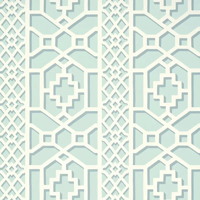
What makes this pattern truly beautiful is its intricate geometric lattice, featuring delicate crosses and hexagonal shapes that create a harmonious rhythm across the wall. The scale strikes a balance between boldness and subtlety, allowing the pattern to feel both dynamic and serene. Negative space is carefully measured, giving the design room to breathe and enhancing its overall visual movement and flow.
The Winter Mint colorway lends the wallpaper a refreshing, light blue hue that shifts gracefully in different lighting conditions. In daylight, the soft blue reads as airy and uplifting, while in the evening, it takes on a cooler, more introspective tone. The wallpaper’s subtle sheen and smooth texture catch light gently, adding depth without overwhelming the eye.
What you’re seeing
The wallpaper showcases a crisp white geometric lattice pattern set against a light blue background. The design’s intricate fretwork consists of interlocking crosses and hexagonal shapes forming a sophisticated trellis motif. The pattern is flat with a clean, graphic quality; there are no metallic or embossed elements, emphasizing a modern, matte finish that enhances its understated elegance.
Material & specs
| Collection | PRINT HAPPY |
|---|---|
| Material | PAPER |
| Pattern repeat | 12.625 in |
| Match | STRAIGHT |
| Roll width | 27.0 in |
| Roll length | 4.5 yards |
| Coverage | 60.75 sq ft |
The Zanzibar Trellis wallpaper is crafted with attention to quality and durability, perfect for transforming your interiors with lasting style.
Styling & pairings
- Pair with soft, natural woods like ash or maple to complement the wallpaper’s gentle blue tones.
- Incorporate brushed nickel or matte brass fixtures for a subtle metallic accent that won’t overpower the pattern.
- Use linen or cotton fabric weaves in neutral shades for upholstery and curtains to maintain a light, airy feel.
- Choose paint colors in warm whites or pale grays to balance the coolness of Winter Mint.
- Opt for minimalist, sculptural lighting to highlight the wallpaper’s geometric precision without cluttering the visual field.
- Introduce glass or ceramic decorative elements in soft pastels to echo the wallpaper’s calming palette.
Where it works
- Powder rooms, where its refined pattern adds visual interest without overwhelming the small space.
- Entryways and hallways, creating an inviting yet sophisticated first impression.
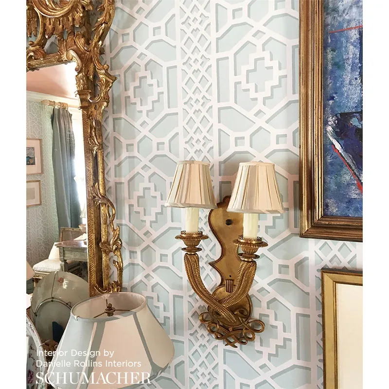
- Living rooms seeking a subtle backdrop that enhances furniture and art.
- Bedrooms, for a serene and restful environment infused with gentle color.
- Home offices, where the structured design supports focus while adding style.
- Accent walls that benefit from the pattern’s graphic clarity and light-reflecting qualities.
Related from WallpaperTwins
Call to action
Explore details and order samples at ZANZIBAR TRELLIS on WallpaperTwins.com.