Schumacher
WATERCOLOR – Schumacher Wallpaper
WATERCOLOR – Schumacher Wallpaper
Design story
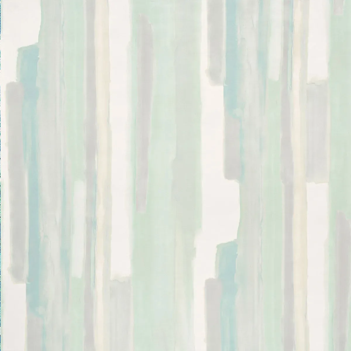
WATERCOLOR by Schumacher Wallpaper evokes a serene and romantic ambiance, inspired by the timeless charm of watercolor painting. This design captures the gentle mood of soft artistry that blends seamlessly into modern and classic interiors alike, perfect for those seeking a subtle yet expressive statement.
The beauty of this pattern lies in its abstract vertical brush strokes that create a sense of movement and flow. The composition balances open negative space with layered, delicate lines, giving it both depth and airiness. Its scale is thoughtfully measured to refresh walls without overwhelming the senses, offering a quiet rhythm that invites calm and contemplation.
The palette centers on celadon tones—soft pastel shades of blue, green, gray, and beige—set against a crisp white background. In daylight, these hues appear cool and refreshing, while in softer evening light they warm slightly, enhancing the wallpaper’s subtle sheen. The finish gently reflects light, emphasizing the nuanced texture and adding visual interest without glare.
What you’re seeing
This wallpaper features abstract vertical brush strokes in soft pastel shades, creating a layered effect reminiscent of watercolor washes blending into one another. The strokes vary in width and opacity, simulating the natural flow of paint on paper. The background remains primarily white, allowing the delicate colors to stand out clearly.
Texture is subtly suggested through the visual layering of the brush strokes, though the surface remains smooth to the touch. There are no metallic or embossed elements in this pattern; instead, its charm derives from the interplay of soft hues and the organic quality of the vertical stripes.
Material & specs
| Collection | MILES REDD |
|---|---|
| Material | UNCOATED NON-WOVEN |
| Pattern repeat | 54.0 in |
| Match | HALF DROP |
| Roll width | 54.75 in |
| Roll length | 10 yards |
| Coverage | 136.875 sq ft |
Below you will find the detailed specifications and material information to help you understand the quality and application process for this wallpaper.
Styling & pairings
- Pair with natural woods like light oak or maple to enhance the wallpaper’s fresh, airy feel.
- Soft matte paints in muted greens or blues complement the celadon tones beautifully.
- Incorporate linen or cotton fabrics with subtle textures for upholstery or curtains to echo the wallpaper’s gentle flow.
- Choose brushed nickel or matte brass fixtures to add understated metallic warmth without overpowering the palette.
- Use soft, diffused lighting to highlight the wallpaper’s delicate color transitions and to maintain a tranquil atmosphere.
- Consider pairing with minimalist, modern furniture to let the wallpaper be the room’s focal point.
Where it works
- Powder rooms: Add a refreshing and elegant backdrop to small spaces where guests gather.
- Entryways: Create a welcoming, calming first impression with the wallpaper’s soothing vertical stripes.
- Dining nooks: Enhance intimate meals with a romantic yet subtle wall covering.
- Headboard walls: Use behind beds to bring a soft, serene mood to the bedroom.
- Home offices: Inspire focus and calm with the understated movement and color flow.
- Living rooms: Refresh walls for a modern, airy feel that complements a variety of decor styles.
Related from WallpaperTwins
Call to action
Explore details and order samples at WATERCOLOR on WallpaperTwins.com.