Schumacher
VERTIGO – Schumacher Wallpaper
VERTIGO – Schumacher Wallpaper

Design story
Vertigo by Schumacher Wallpaper channels the sleek, modernist energy of mid-century Danish design, offering a subtle yet dynamic statement for contemporary interiors. Inspired by the pioneering work of Arne Jacobsen, this pattern evokes a mood of refined sophistication with a rhythmic, almost hypnotic quality.
The beauty of Vertigo lies in its geometric motifs—circles divided into halves and quarters—that create a captivating sense of movement and visual balance. The interplay of positive and negative space lends an airy openness, while the repeating shapes maintain harmony and flow. Its scale is thoughtfully designed to be impactful without overwhelming the room.
The pearl colorway enhances the design with calming light gray tones that subtly shift throughout the day. In natural daylight, the wallpaper reads as a soft, matte base with gentle contrasts, while evening lighting brings out a delicate sheen that adds depth and texture. This nuanced surface quality creates an inviting ambiance, perfect for both minimalist and layered spaces.
What you’re seeing
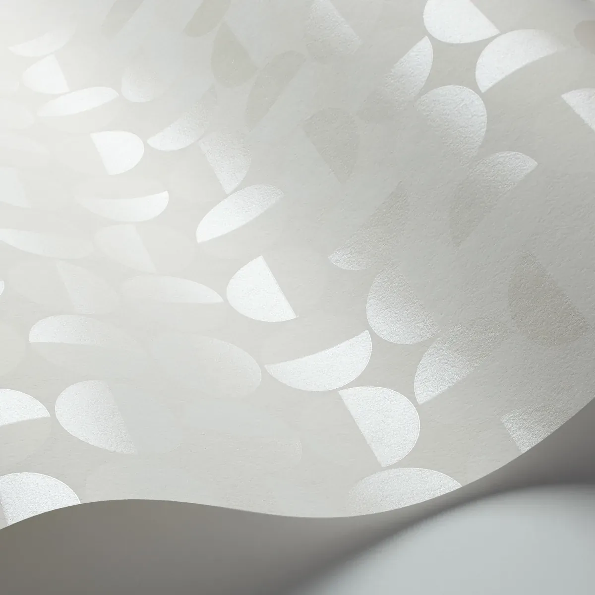
Vertigo features a repeating geometric pattern of overlapping circles precisely divided into halves and quarters. The pattern’s clean lines and balanced composition create a sense of rhythm and sophistication. The wallpaper’s texture is smooth with a subtle sheen, enhancing the soft gray tones without overpowering them.
There are no metallic or embossed effects; instead, the focus is on the clarity of form and the quiet elegance of the light pearl color. This restrained approach highlights the design’s architectural influence, making it a versatile backdrop that can complement a wide range of decor styles.
Material & specs
| Collection | BORÅSTAPETER |
|---|---|
| Material | NON-WOVEN |
| Pattern repeat | 6.75 in |
| Match | STRAIGHT |
| Roll width | 20.875 in |
| Roll length | 11 yards |
| Coverage | 57.406 sq ft |
Schumacher’s Vertigo wallpaper is crafted with quality and sustainability in mind, offering both durability and environmental responsibility.
Styling & pairings
- Pair with light-colored woods such as ash or maple to maintain a fresh, airy atmosphere.
- Complement with brushed nickel or matte chrome fixtures for a sleek, modern metallic accent.
- Incorporate soft fabric weaves like linen or cotton in neutral tones to add tactile warmth and contrast.
- Use muted paint colors such as dove gray or soft white to enhance the wallpaper’s subtle palette without competing.
- Balance the geometric precision with organic elements like potted greenery or sculptural ceramics to soften the overall look.
- Opt for minimalist, diffused lighting to emphasize the wallpaper’s gentle sheen and create a calming ambiance.
Related from WallpaperTwins
Call to action
Explore details and order samples at VERTIGO on WallpaperTwins.com.