
Schumacher
ORISSA PANEL – Schumacher Wallpaper
ORISSA PANEL – Schumacher Wallpaper
Design story
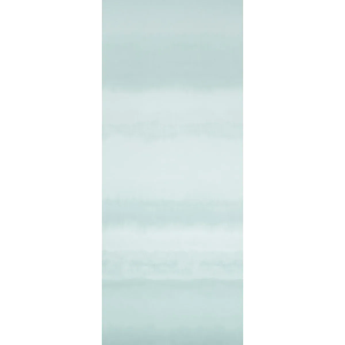
The ORISSA PANEL by Schumacher Wallpaper channels a serene, artisanal vibe that feels both timeless and contemporary. Inspired by traditional textile techniques such as ikat and shibori, this pattern brings a gentle, handcrafted aesthetic into modern interiors, perfect for creating calming, mindful spaces.
What makes this design truly beautiful is its soft, watercolor-like horizontal stripes that flow across an expansive 12-foot tall panel. The motif’s subtle gradient and delicate line quality evoke a peaceful sense of movement, reminiscent of a tranquil seascape or a misty landscape. Negative space is thoughtfully balanced, allowing the pattern to breathe and avoid visual clutter.
The palette, named Mineral, features soothing light blue tones that appear fresh and airy in daylight, while offering a softer, moodier presence in evening light. The wallpaper’s finish gently reflects ambient light, enhancing its watercolor effect without overwhelming sheen or gloss. This subtle texture invites touch and complements both natural and artificial lighting.
What you’re seeing
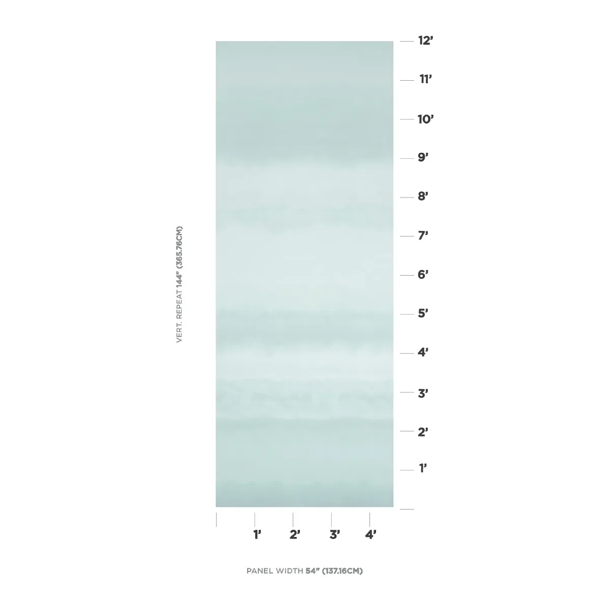
The ORISSA PANEL showcases horizontal watercolor stripes in varying shades of light blue, creating a calm gradient that runs smoothly across the panel. The pattern’s appearance mimics artisanal fabric dyeing methods, lending an organic and tactile quality to the surface.
There are no metallic or embossed effects; instead, the wallpaper relies on its soft tonal shifts and delicate line work to convey depth and nuance. The overall effect is one of understated sophistication, with a focus on natural beauty and subtle artistry rather than bold graphic statements.
Material & specs
| Collection | PANELS |
|---|---|
| Material | UNCOATED NON-WOVEN |
| Pattern repeat | 144 |
| Match | STRAIGHT |
| Roll width | 54.0 in |
| Roll length | 4 yards |
| Coverage | 54.0 sq ft |
This wallpaper combines premium craftsmanship with practical design considerations to ensure both beauty and durability.
Styling & pairings
- Pair with natural woods like light oak or ash to enhance the wallpaper’s organic, coastal-inspired feel.
- Soft linen or cotton fabrics in neutral tones complement the gentle blue hues without competing for attention.
- Brushed nickel or matte brass fixtures provide a refined metallic accent that harmonizes with the wallpaper’s understated palette.
- Use creamy whites or muted greys on adjacent walls or trim to maintain a serene, cohesive atmosphere.
- Incorporate soft, diffused lighting—such as frosted glass sconces or shaded table lamps—to highlight the wallpaper’s watercolor texture.
Where it works
- Perfect for creating a tranquil feature wall in a bedroom or master suite.
- Ideal in powder rooms or small bathrooms where a calming, spa-like ambiance is desired.
- Add character to entryways or hallways, making these transitional spaces feel more inviting.
- Use in dining nooks to foster a relaxed, intimate dining experience.
- Beautiful as a backdrop behind seating areas or reading corners, adding depth without distraction.
Related from WallpaperTwins
Call to action
Explore details and order samples at ORISSA PANEL on WallpaperTwins.com.