
Schumacher
ORISSA PANEL – Schumacher Wallpaper
ORISSA PANEL – Schumacher Wallpaper
Design story
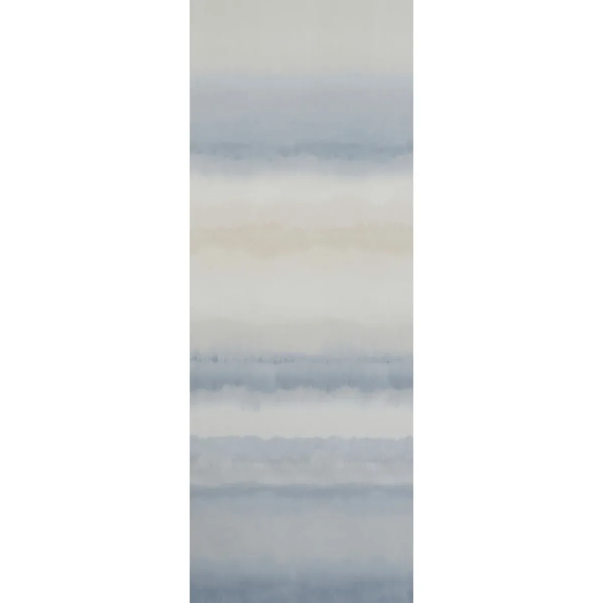
The ORISSA PANEL by Schumacher Wallpaper evokes a serene, artisanal aesthetic reminiscent of traditional ikat and shibori textile techniques. This pattern effortlessly blends a modern watercolor softness with a timeless, handcrafted feel, making it ideal for creating a calm, contemplative atmosphere in contemporary interiors.
What makes this wallpaper truly beautiful is its expansive 12-foot tall panel format that showcases soft, horizontal stripes in varying widths. The gentle movement of the lines creates a rhythmic flow across the wall, while generous negative space allows the pattern to breathe and maintain a subtle elegance. The delicate transitions between hues and the watercolor effect lend it an organic, painterly quality that feels both sophisticated and relaxed.
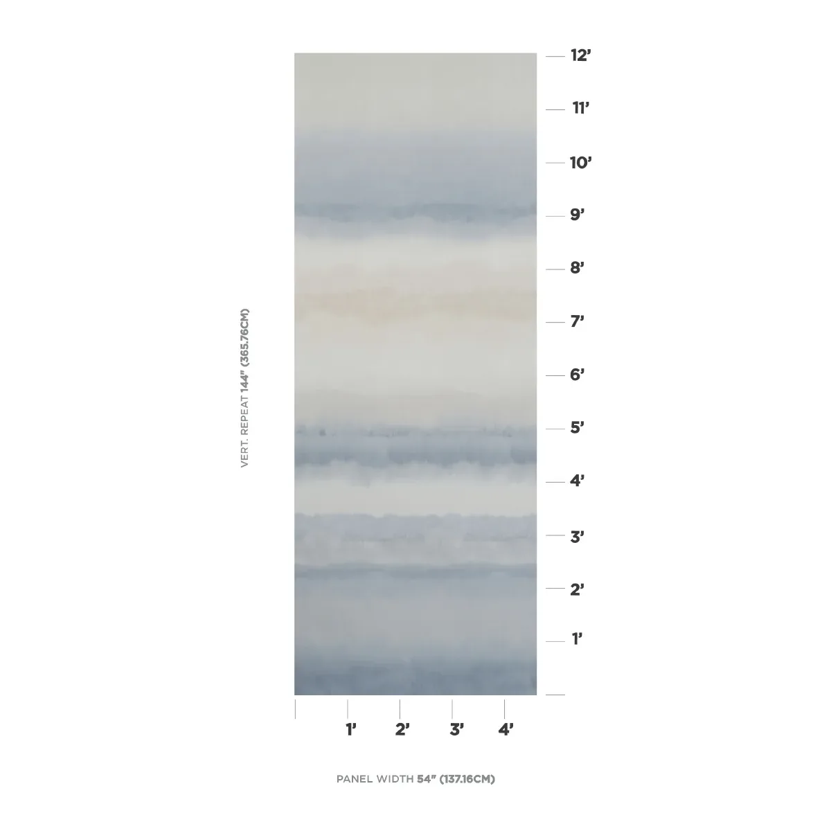
The palette of blue and natural tones reads beautifully in natural daylight, where the cool blues evoke the tranquility of a seascape or sky, balanced by warm beige and soft gray accents. In evening light, the colors deepen subtly, enhancing the wallpaper’s soothing character. A matte finish ensures minimal sheen, allowing the texture and color shifts to remain soft and understated rather than reflective.
What you’re seeing
The ORISSA PANEL features soft horizontal watercolor stripes in shades of blue, gray, and beige, creating a gentle gradient reminiscent of a lush seascape or landscape. The pattern’s brushstroke-like quality mimics artisanal dyeing methods, with visible variations in tone that add depth and texture. There are no metallic or embossed effects, allowing the natural texture and subtle color layering to take center stage. The overall look is calm, understated, and effortlessly elegant.
Material & specs
| Collection | AQUARELLE |
|---|---|
| Material | UNCOATED NON-WOVEN |
| Pattern repeat | 144 |
| Match | STRAIGHT |
| Roll width | 54.0 in |
| Roll length | 4 yards |
| Coverage | 54.0 sq ft |
This wallpaper is crafted to provide a durable yet refined finish suitable for a variety of interiors.
Styling & pairings
- Pair with natural wood tones like light oak or walnut to enhance the organic, earthy feel.
- Complement with brushed nickel or matte brass fixtures to maintain a soft metallic contrast without overpowering the palette.
- Use linen or cotton fabric weaves in neutral shades for upholstery and drapery to echo the wallpaper’s artisanal inspiration.
- Consider soft, muted paint colors such as warm off-whites or pale grays to keep the atmosphere light and airy.
- Incorporate warm ambient lighting, like dimmable sconces or pendant lamps with fabric shades, to highlight the watercolor texture without harsh glare.
Where it works
- Ideal for a calming powder room where the soft hues promote relaxation.
- Perfect as an accent wall in entryways or hallways to make a sophisticated first impression.
- Enhances dining nooks by adding subtle color and texture without competing with furnishings.
- Works beautifully behind a bed as a serene headboard wall, creating a tranquil retreat.
- Suitable for cozy reading corners or home offices that benefit from a restful, inspiring backdrop.
Related from WallpaperTwins
Call to action
Explore details and order samples at ORISSA PANEL on WallpaperTwins.com.