
Schumacher
OPUS – Schumacher Wallpaper
OPUS – Schumacher Wallpaper

Design story
The OPUS pattern by Schumacher Wallpaper channels a timeless elegance reminiscent of classic interiors, yet with a fresh, contemporary sensibility. Its understated design evokes a serene, refined mood ideal for both modern and traditional homes seeking subtle sophistication.
What makes OPUS truly beautiful is its delicate balance of narrow vertical stripes enlivened by rows of dainty dots. The hand-drawn quality of the pattern lends it a gentle movement and rhythm, while the carefully spaced negative space allows the design to breathe. This combination creates a visual texture that is both intricate and calming, perfect for adding quiet character without overwhelming a room.
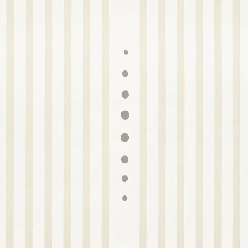
The PARCHMENT colorway plays gracefully with light, appearing as a soft cream in daylight and deepening to a warm glow in the evening. The screen-printed paper has a subtle sheen that catches light gently, enhancing the texture without glare, making it an excellent choice for spaces where natural and artificial light vary throughout the day.
What you’re seeing
The wallpaper features subtle vertical stripes paired with evenly spaced dotted vertical lines, creating a refined linear pattern across the surface. The dots are small and delicate, contributing a hand-crafted feel to the design. The texture is smooth with a slight tactile quality from the screen-printing process, but there are no metallic or embossed effects present. The overall look is one of quiet elegance, perfect for classic decor schemes that favor understated detail.
Material & specs
| Collection | David Oliver |
|---|---|
| Material | PAPER |
| Pattern repeat | 4.25 in |
| Match | STRAIGHT |
| Roll width | 27.0 in |
| Roll length | 4.5 yards |
| Coverage | 60.75 sq ft |
Discover the quality and craftsmanship behind OPUS with the detailed material specifications below.
Styling & pairings
- Materials: Pair with natural linens or soft cotton fabrics to maintain a light, airy atmosphere.
- Metals: Warm brushed brass or antique gold fixtures complement the parchment tones beautifully.
- Woods: Light to medium oak or maple woods enhance the wallpaper’s subtle warmth without overpowering it.
- Fabric weaves: Incorporate textured weaves like boucle or soft velvet to add depth and tactile contrast.
- Paint directions: Choose muted neutrals or soft whites for trim and ceilings to keep spaces feeling open and cohesive.
- Lighting notes: Use diffused warm lighting to highlight the pattern’s gentle sheen and invite a cozy ambiance.
Where it works
- Powder rooms, where subtle elegance makes a big impact in a small space.
- Entryways, to create a welcoming yet refined first impression.
- Dining nooks, where the understated pattern adds charm without distracting from table settings.
- Headboard walls, providing a serene backdrop that enhances bedroom calmness.
- Home offices, where the delicate design fosters focus and a sense of order.
Related from WallpaperTwins
Call to action
Explore details and order samples at OPUS on WallpaperTwins.com.