
Schumacher
KATA PAPERWEAVE – Schumacher Wallpaper
KATA PAPERWEAVE – Schumacher Wallpaper
Design story
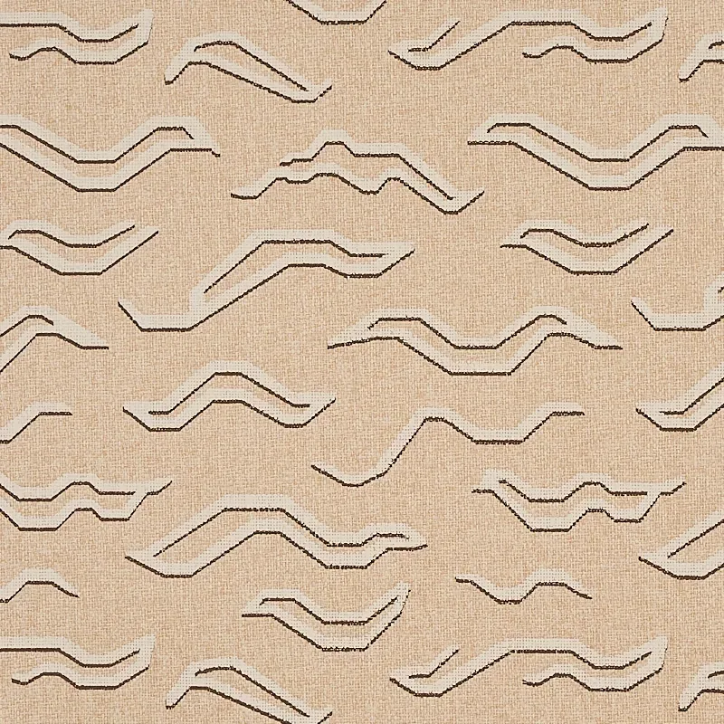
Kata Paperweave by Schumacher Wallpaper channels a sophisticated, global-inspired aesthetic with its abstract interpretation of a Tibetan tiger pattern. This design evokes a timeless, mid-century modern vibe, perfect for those who appreciate subtle cultural references blended with contemporary style.
What makes Kata Paperweave truly beautiful is its mid-scale, allover pattern that balances movement and calm through its abstract zigzag and wave motifs. The pattern’s rhythmic flow is enhanced by thoughtful negative space and handprinted line quality, lending a handcrafted charm that elevates any room’s character.
The palette is a warm oatmeal tone with subtle tonal variations that create an antiqued, layered effect. In daylight, the wallpaper reveals nuanced shades of beige and soft browns, while in evening lighting, the deeper accents gently recede, adding depth without overwhelming. Its paperweave texture adds a natural matte finish that softly diffuses light, enhancing the wallpaper’s tactile appeal and understated sheen.
What you’re seeing
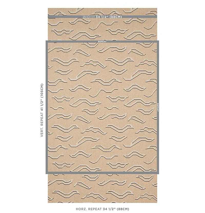
The Kata Paperweave pattern features abstract zigzag and wave forms rendered in light and dark brown shades on a textured, paperweave ground. This creates a dynamic yet restrained geometric composition that is both modern and organic. The handprinted method contributes subtle tonal shifts and an antiqued look, emphasizing the artisanal quality of the wallpaper.
The surface texture is tactile and fibrous, typical of paperweave, which enhances the visual depth and invites closer inspection. There are no metallic or embossed elements, allowing the beauty of the natural texture and pattern movement to take center stage without distraction.
Material & specs
| Collection | TAPIS |
|---|---|
| Material | PAPER |
| Pattern repeat | 41.5 in |
| Match | STRAIGHT |
| Roll width | 34.5 in |
| Roll length | 4 yards |
| Coverage | 34.5 sq ft |
Below you will find the detailed specifications and material information for Kata Paperweave by Schumacher Wallpaper.
Styling & pairings
- Pair with natural wood finishes like oak or walnut to complement the warm oatmeal tones and bring an organic warmth to your space.
- Incorporate matte brass or aged bronze accents in lighting fixtures and hardware to enhance the subtle antiqued character of the wallpaper.
- Use soft, woven fabrics such as linen or cotton in neutral shades to echo the paperweave texture and maintain a cohesive, tactile environment.
- Paint walls or trim in warm off-whites or muted taupes to create a harmonious, layered palette that lets the wallpaper pattern stand out.
- Choose ambient lighting with warm color temperatures to highlight the tonal variations and texture in the wallpaper, enriching the room’s atmosphere.
Related from WallpaperTwins
Call to action
Explore details and order samples at KATA PAPERWEAVE on WallpaperTwins.com.