Schumacher
HARUKI SISAL – Schumacher Wallpaper
HARUKI SISAL – Schumacher Wallpaper
Design story
HARUKI SISAL by Schumacher Wallpaper channels a refined, modern elegance rooted in natural textures and timeless craftsmanship. Its woven-inspired pattern evokes a calm, collected mood ideal for serene living spaces or sophisticated work environments. Drawing influence from both mid-century modern minimalism and organic Japanese aesthetics, this design perfectly balances tradition with contemporary flair.
What makes HARUKI SISAL truly beautiful is its subtle interplay of texture and pattern. The woven motif creates a gentle movement across the wall, with a delicate scale that feels neither overwhelming nor overly sparse. The thoughtful use of negative space enhances the tactile quality, allowing the eye to appreciate the fine lines and the rhythm created by the sisal weave.
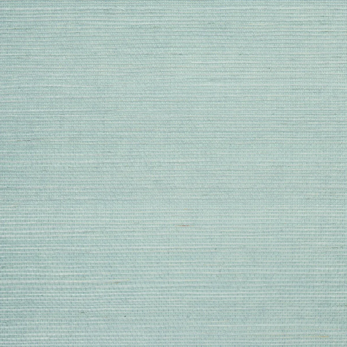
The Robin’s Egg colorway offers a fresh, light blue-green tone that shifts gracefully throughout the day. In natural daylight, the color reads as a soft, airy hue with a slight sheen that highlights the material’s depth. As evening falls, the wallpaper takes on a richer, more intimate character, where the subtle texture catches ambient light, enhancing a room’s warmth and sophistication.
What you’re seeing
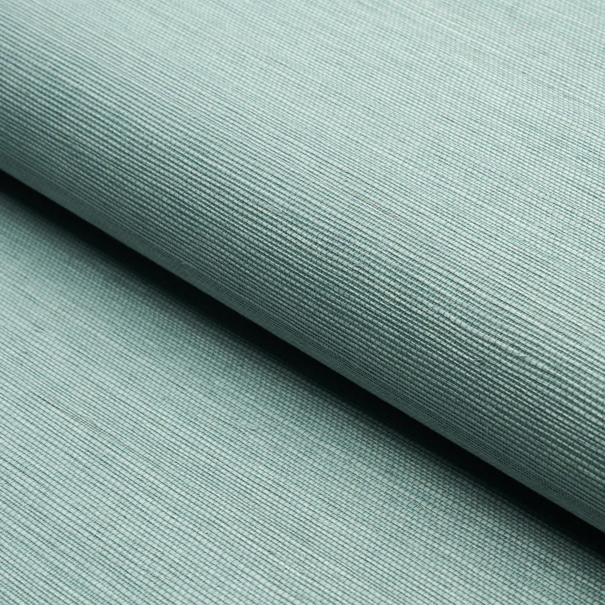
Up close, HARUKI SISAL reveals a finely woven texture reminiscent of natural sisal fibers, but with a smooth, refined finish that adds sophistication. The pattern is composed of interlaced lines creating a basketweave effect in a consistent, light blue-green tone. This isn’t a printed design but a textured wallcovering offering a gentle sheen that reflects light softly. There are no metallic or embossed highlights; instead, the beauty lies in the tactile surface and the subtle variation of color within the weave.
Material & specs
| Collection | ESSENTIAL |
|---|---|
| Material | PAPER |
| Match | RANDOM |
| Roll width | 36.0 in |
| Roll length | 4 yards |
| Coverage | 72.0 sq ft |
This wallpaper combines durability with style, crafted to enhance both residential and commercial interiors.
Styling & pairings
- Pair with natural wood finishes like light oak or bamboo to emphasize the organic texture.
- Incorporate brushed brass or matte black metal accents for a modern, polished contrast.
- Layer with linen or cotton fabric weaves in neutral or complementary blue-green tones to enrich the tactile experience.
- Use soft white or pale grey paint shades on trim and ceilings to maintain a light, airy atmosphere.
- Install warm, dimmable lighting to accentuate the wallpaper’s sheen without overpowering the subtle texture.
Where it works
- Perfect for powder rooms, where its texture adds depth without overwhelming small spaces.
- Ideal in entryways to create a welcoming, calm first impression.
- Works beautifully in dining nooks that benefit from a hint of color and tactile interest.
- A sophisticated choice for bedroom accent walls, pairing tranquility with modern design.
- Suitable for refined home offices or libraries seeking understated elegance.
Related from WallpaperTwins
Call to action
Explore details and order samples at HARUKI SISAL on WallpaperTwins.com.