Schumacher
HARUKI SISAL – Schumacher Wallpaper
HARUKI SISAL – Schumacher Wallpaper
Design story
HARUKI SISAL from Schumacher Wallpaper embodies a timeless blend of natural elegance and modern sophistication. Inspired by the tactile beauty of woven fibers, this pattern evokes a serene, grounded mood reminiscent of mid-century design sensibilities fused with contemporary minimalism.
The wallpaper’s charm lies in its subtle woven motif that captures both texture and movement without overwhelming the eye. Its delicate interplay of lines and negative space creates a refined visual rhythm, offering a sophisticated alternative to flat, painted walls. The scale is carefully balanced to provide interest up close, yet maintain calm and cohesion when viewed across a full room.
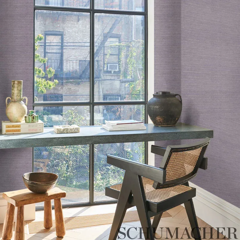
Rendered in the Patina colorway, this design plays beautifully with natural and artificial light. During the day, the soft sheen accentuates its woven texture, offering a warm, inviting glow. In the evening, the muted beige hues deepen, lending the space a cozy yet polished ambiance that feels both organic and luxurious.
What you’re seeing
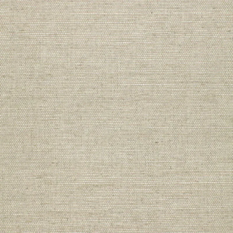
HARUKI SISAL showcases a close-up pattern reminiscent of carefully woven fabric, emphasizing a natural fiber appearance with subtle texture. The wallpaper’s tactile quality is evident in its fine, woven weave effect that adds depth without heavy embossing or metallic accents. Instead, the design relies on a gentle sheen that highlights the intricate weave, adding dimension and a soft reflective quality.
This neutral beige textured wallpaper is designed to bring warmth and understated character to any interior. The pattern’s simplicity and natural inspiration make it adaptable, while the textural surface provides a sensory experience beyond what paint can offer.
Material & specs
| Collection | ESSENTIAL |
|---|---|
| Material | PAPER |
| Match | RANDOM |
| Roll width | 36.0 in |
| Roll length | 4 yards |
| Coverage | 72.0 sq ft |
Explore the detailed specifications of HARUKI SISAL below to understand its composition and installation requirements.
Styling & pairings
- Complementary materials: Natural woods like oak or walnut enhance the wallpaper’s organic vibe.
- Metals: Brushed brass or matte black fixtures add subtle contrast without overpowering the texture.
- Fabric weaves: Linen or cotton upholstery in neutral tones complement the tactile theme beautifully.
- Paint directions: Soft off-whites or warm greiges harmonize with the Patina color’s warmth.
- Lighting notes: Soft, diffused lighting enhances the wallpaper’s sheen and texture, creating inviting atmospheres.
Where it works
- Powder rooms: Adds warmth and tactile interest in small spaces.
- Entries and hallways: Creates a welcoming, natural backdrop that sets the tone for the home.
- Living rooms: Elevates neutral palettes with subtle texture and depth.
- Bedrooms: Provides a cozy, serene environment with understated sophistication.
- Offices and libraries: Enhances focus and calm with its natural, grounded aesthetic.
Related from WallpaperTwins
Call to action
Explore details and order samples at HARUKI SISAL on WallpaperTwins.com.