Schumacher
HARUKI SISAL – Schumacher Wallpaper
HARUKI SISAL – Schumacher Wallpaper
Design story
The HARUKI SISAL wallpaper by Schumacher captures a timeless elegance rooted in natural textures and understated sophistication. Inspired by traditional sisal fibers, this pattern evokes a calm, organic mood perfect for modern interiors seeking a connection to nature without sacrificing refinement.
What sets HARUKI SISAL apart is its subtle yet compelling weave motif that mimics the look of woven linen. The pattern’s horizontal lines create a gentle movement across the wall, balanced by ample negative space that allows the texture to breathe. The scale is moderate, offering a tactile interest that enriches rather than overwhelms a room.
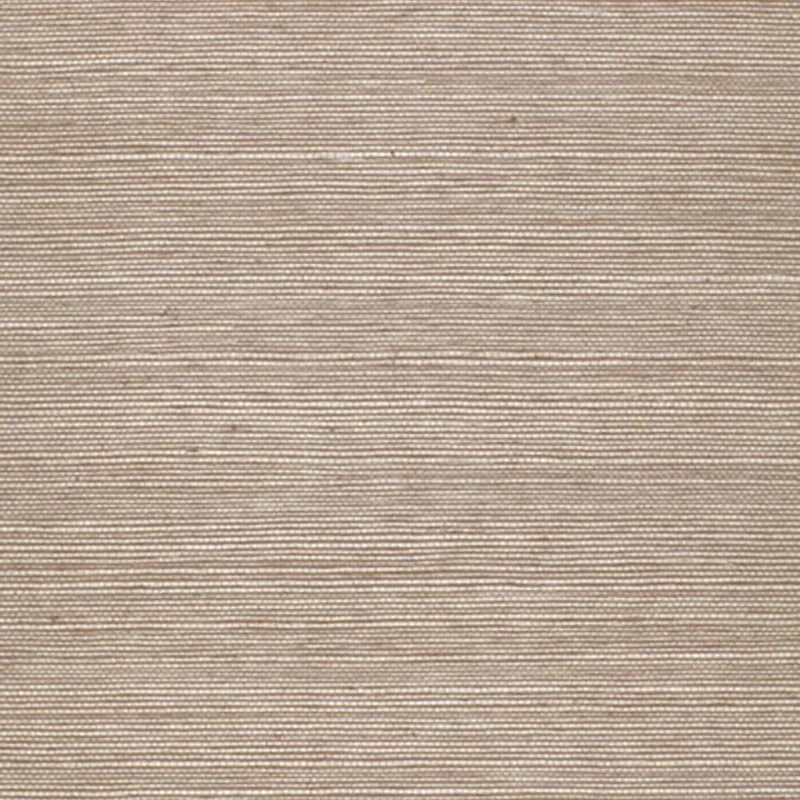
In the MOCHA colorway, the wallpaper reads as a warm beige with a delicate sheen that shifts beautifully from daylight to evening glow. Its finish captures light to highlight the weave texture, adding depth and a soft luminosity that changes subtly with the room’s ambient lighting.
What you’re seeing
The HARUKI SISAL wallpaper features a beige textured surface with a subtle horizontal linen-like weave pattern. This design is characterized by its tactile quality, resembling natural fibers woven tightly together. There are no metallic or embossed effects; instead, the beauty lies in the nuanced texture and the soft, reflective sheen that enhances the naturalistic look.
The overall effect is one of understated luxury—textured enough to invite touch and visual interest, yet restrained to complement a variety of interior styles. The neutral beige tone serves as a versatile backdrop, allowing other design elements in the room to shine.
Material & specs
| Collection | PERFECT BASICS: HARUKI SISAL |
|---|---|
| Material | PAPER |
| Match | RANDOM |
| Roll width | 36.0 in |
| Roll length | 4 yards |
| Coverage | 72.0 sq ft |
Below you’ll find detailed product specifications for HARUKI SISAL.
Styling & pairings
- Pair with natural woods such as oak or walnut to emphasize warmth and organic appeal.
- Complement with soft linen or cotton upholstery fabrics to enhance the textural harmony.
- Incorporate matte or brushed brass fixtures to add subtle metallic warmth without overpowering the pattern.
- Use warm neutral paint tones like creamy ivory or soft taupe to maintain a cohesive, serene palette.
- Opt for soft, diffused lighting to accentuate the wallpaper’s sheen and texture gently.
- Consider minimalistic, clean-lined furniture to balance the tactile complexity of the wallcovering.
Where it works
- Powder rooms, where its subtle texture adds interest without overwhelming small spaces.
- Entryways and foyers, creating a welcoming and sophisticated first impression.
- Dining nooks, enhancing cozy ambiance with a tactile warmth that complements wood furniture.
- Headboard walls in bedrooms, providing a soft, natural backdrop that invites relaxation.
- Home offices, where the neutral palette supports focus while the texture adds visual depth.
Related from WallpaperTwins
Call to action
Explore details and order samples at HARUKI SISAL on WallpaperTwins.com.