Schumacher
HARUKI SISAL – Schumacher Wallpaper
HARUKI SISAL – Schumacher Wallpaper
Design story
The HARUKI SISAL wallpaper by Schumacher invites a calm, contemporary mood inspired by the timeless elegance of natural fibers and minimalist design. Its subtle woven texture evokes a sense of grounded tranquility, perfect for modern interiors seeking understated sophistication.
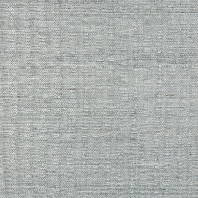
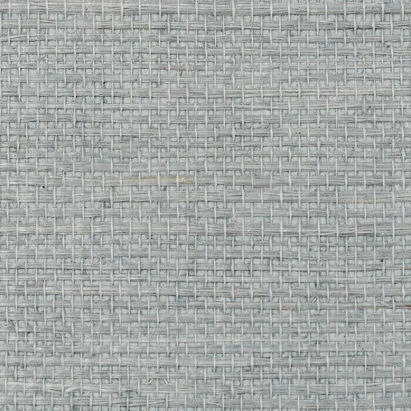
What makes this pattern truly beautiful is its delicate interplay of horizontal and vertical lines that mimic the intricate weave of sisal fabric. The design’s fine scale and carefully balanced negative space create a rhythmic movement across the wall, delivering a tactile quality that feels both refined and inviting.
The blue grey colorway shifts gracefully throughout the day, appearing cooler and more serene in daylight while warming slightly under evening light. The wallpaper’s subtle sheen enhances its texture, catching light softly to give walls a dynamic, layered finish that elevates beyond the flatness of paint.
What you’re seeing
Visually, HARUKI SISAL reveals a light gray textured surface with a subtle woven fabric pattern formed by intersecting horizontal and vertical lines. The pattern’s structure closely resembles natural sisal fibers, lending an organic yet orderly feel. There are no metallic or embossed effects; instead, the emphasis is on tactile richness and a smooth, elegant sheen that reflects light delicately.
Material & specs
| Collection | PERFECT BASICS: HARUKI SISAL |
|---|---|
| Material | PAPER |
| Match | RANDOM |
| Roll width | 36.0 in |
| Roll length | 4 yards |
| Coverage | 72.0 sq ft |
Below is the detailed specification for HARUKI SISAL wallpaper.
Styling & pairings
- Natural materials: Pair with jute rugs, linen upholstery, and rattan furniture to enhance the organic vibe.
- Metals: Soft brushed nickel or matte brass fixtures complement the wallpaper’s subtle sheen without overpowering it.
- Woods: Light oak or ash wood tones work beautifully, adding warmth and continuity with the woven texture.
- Fabric weaves: Incorporate textured linens and cottons with subtle patterns to maintain a layered, tactile environment.
- Paint directions: Soft whites, muted blues, or greys work well on adjacent walls or trim to keep the palette cohesive and calming.
- Lighting notes: Use diffused ambient lighting to accentuate the wallpaper’s sheen and texture without harsh glare.
Where it works
- Powder rooms – creates an elegant, inviting backdrop with tactile interest.
- Entryways – offers a subtle statement that welcomes guests warmly.
- Dining nooks – adds understated texture that enhances intimate dining spaces.
- Home offices – promotes a calm and focused atmosphere with natural inspiration.
- Living rooms – complements minimalist decor while adding depth and warmth.
Related from WallpaperTwins
Call to action
Explore details and order samples at HARUKI SISAL on WallpaperTwins.com.