Schumacher
HARUKI SISAL – Schumacher Wallpaper
HARUKI SISAL – Schumacher Wallpaper
Design story
The HARUKI SISAL wallpaper by Schumacher evokes a serene and timeless ambiance, inspired by natural fibers and understated elegance. Rooted in a modern lifestyle aesthetic, it channels a subtle nod to mid-century minimalism while embracing the tactile richness of woven materials.
What makes this pattern truly beautiful is its delicate interplay of texture and tone. The subtle horizontal woven fibers create a sense of quiet movement across the wall, with a scale that feels intimate yet expansive. The design balances negative space and line quality expertly, allowing the wallcovering to offer visual interest without overwhelming a room’s decor.
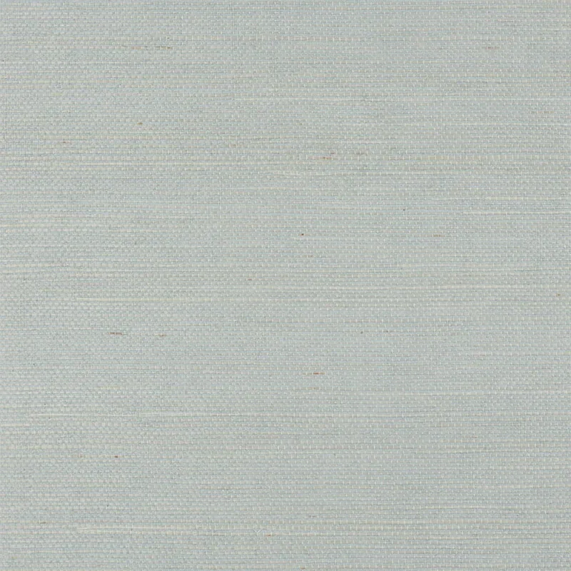
The MINERAL colorway brings a soft, light blue hue that shifts gently under different lighting conditions. In daylight, its matte finish and subtle sheen highlight the woven texture, creating a calm, airy atmosphere. In the evening, the color deepens slightly, with the tactile surface absorbing ambient light to maintain warmth and depth.
What you’re seeing
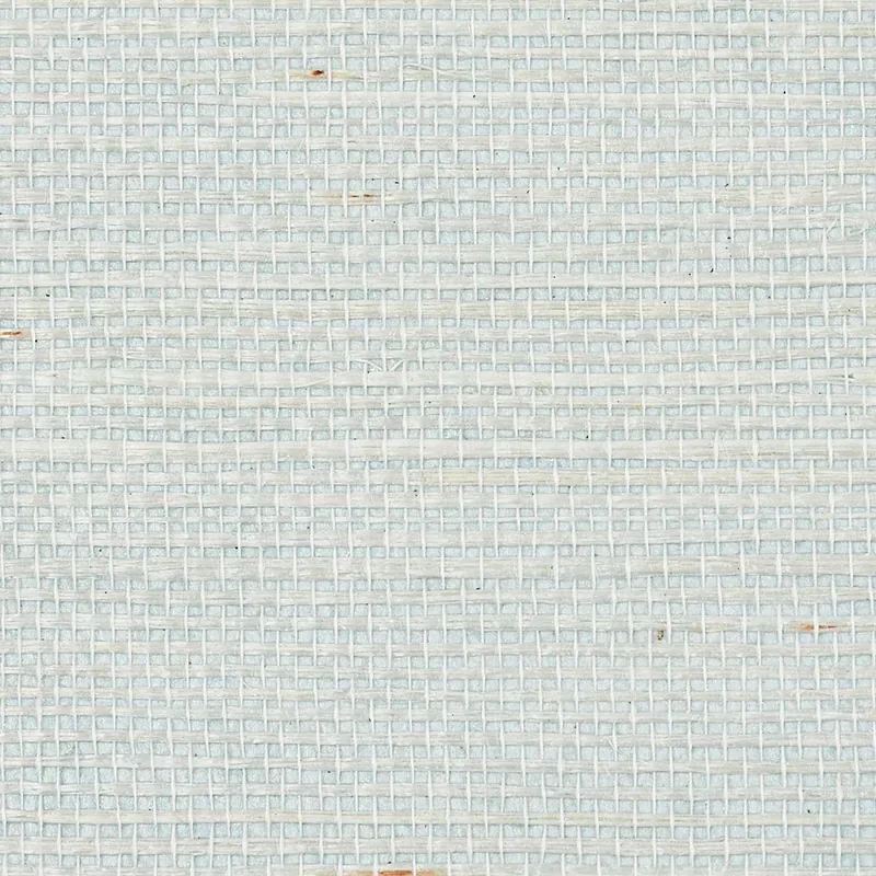
This wallpaper features a close-up texture of light blue woven fibers, arranged horizontally to mimic natural sisal. The surface is matte with a subtle sheen that enhances the tactile quality without appearing glossy. There are no metallic or embossed effects, keeping the overall look understated and refined.
The visible motif is the weave itself — a linear, repetitive pattern that suggests handcrafted artistry. The fine, horizontal striations resemble natural fibers, lending an organic character to the wallcovering. This texture invites touch and adds dimensionality, making it a sophisticated alternative to flat paint.
Material & specs
| Collection | PERFECT BASICS: HARUKI SISAL |
|---|---|
| Material | PAPER |
| Match | RANDOM |
| Roll width | 36.0 in |
| Roll length | 4 yards |
| Coverage | 72.0 sq ft |
Below you will find detailed specifications for the HARUKI SISAL wallpaper.
Styling & pairings
- Natural woods: Light oak or ash complements the organic feel, enhancing warmth and softness.
- Matte metals: Brushed nickel or matte black fixtures add modern contrast without overpowering the texture.
- Textured fabrics: Linen or cotton weaves in neutral tones create a layered, tactile environment.
- Soft paint colors: Pale greys, muted blues, or creamy whites harmonize with the MINERAL colorway.
- Ambient lighting: Warm, diffused light accentuates the wallpaper’s subtle sheen and texture.
- Minimalist decor: Clean-lined furniture and simple shapes allow the wallpaper’s character to shine.
Where it works
- Powder rooms: Adds texture and interest to small, intimate spaces.
- Entryways: Creates a welcoming yet sophisticated first impression.
- Dining rooms: Enhances atmosphere with subtle depth and tactile appeal.
- Bedrooms: Promotes calm and serenity with its soft color and texture.
- Home offices: Provides a refined backdrop that inspires focus without distraction.
Related from WallpaperTwins
Call to action
Explore details and order samples at HARUKI SISAL on WallpaperTwins.com.