Schumacher
HARUKI SISAL – Schumacher Wallpaper
HARUKI SISAL – Schumacher Wallpaper

Design story
The HARUKI SISAL wallpaper from Schumacher evokes a serene, timeless mood inspired by natural textures and understated elegance. Its design nods to mid-century modern sensibilities while embracing a contemporary appreciation for tactile, organic surfaces.
What makes this pattern truly beautiful is its subtle interplay of horizontal and vertical weave motifs. The texture creates a delicate grid of intersecting lines that bring a sense of calm movement and refined structure. The scale is modest—allowing the pattern to feel spacious and open, with plenty of negative space enhancing its quiet sophistication.
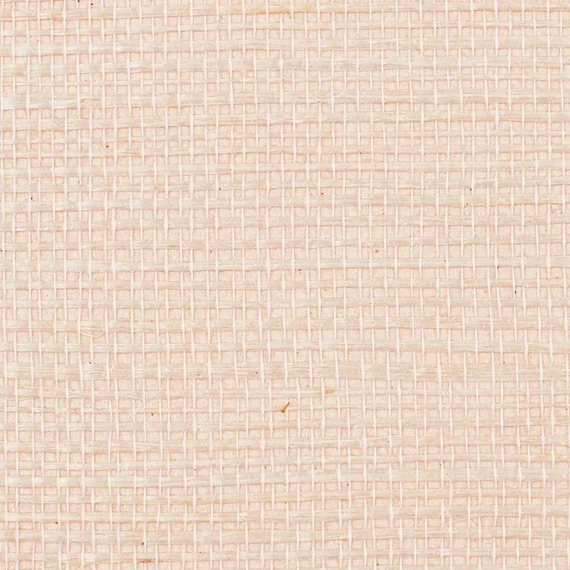
The Petal colorway offers a soft beige tone that shifts gently with the light throughout the day. In bright daylight, it reads as a warm, natural fabric; in evening light, its subtle sheen adds depth and a gentle glow. The surface’s fine texture captures light beautifully, making it a graceful alternative to flat paint.
What you’re seeing
The wallpaper features a light beige textured fabric look, woven with subtle horizontal and vertical patterns reminiscent of natural sisal fibers. The weave effect is precise yet soft, creating a tactile surface that invites closer inspection. This wallcovering does not rely on bold motifs or metallic highlights; rather, it emphasizes refined texture and a gentle sheen for understated luxury.
Material & specs
| Collection | PERFECT BASICS: HARUKI SISAL |
|---|---|
| Material | PAPER |
| Match | RANDOM |
| Roll width | 36.0 in |
| Roll length | 4 yards |
| Coverage | 72.0 sq ft |
Below you will find detailed specifications that outline the quality and characteristics of HARUKI SISAL wallpaper.
Styling & pairings
- Pair with natural wood finishes like light oak or ash to reinforce the organic, earthy feel.
- Complement with warm metals such as brushed brass or antique gold for subtle elegance.
- Combine with linen or cotton fabric weaves in neutral tones for added texture and softness.
- Use soft matte or eggshell paint colors in warm neutrals or muted pastels to harmonize with the wallpaper’s palette.
- Incorporate warm ambient lighting, such as diffused pendant lamps or wall sconces, to enhance the wallpaper’s subtle sheen and depth.
Where it works
- Powder rooms, where the tactile texture adds interest without overwhelming small spaces.
- Entryways and hallways, creating a welcoming and sophisticated first impression.
- Living rooms or reading nooks, providing warmth and a natural backdrop for layered décor.
- Bedrooms, where its calming palette and texture contribute to a restful atmosphere.
- Home offices, offering a refined yet unobtrusive background that inspires focus.
Related from WallpaperTwins
Call to action
Explore details and order samples at HARUKI SISAL on WallpaperTwins.com.