Schumacher
HARUKI SISAL – Schumacher Wallpaper
HARUKI SISAL – Schumacher Wallpaper
Design story
HARUKI SISAL by Schumacher Wallpaper brings a serene and timeless presence to any interior. Inspired by natural fibers and traditional weaving techniques, this pattern evokes a calm, sophisticated mood reminiscent of modern organic design trends. It fits seamlessly into both classic and contemporary lifestyles.
What makes HARUKI SISAL truly beautiful is its subtle interplay of texture and movement. The pattern features delicate horizontal streaks that create a gentle rhythm across the surface, reminiscent of woven fabric. Its restrained scale and ample negative space give the wallcovering an airy, uncluttered feel that enhances the room’s architecture without overwhelming it.
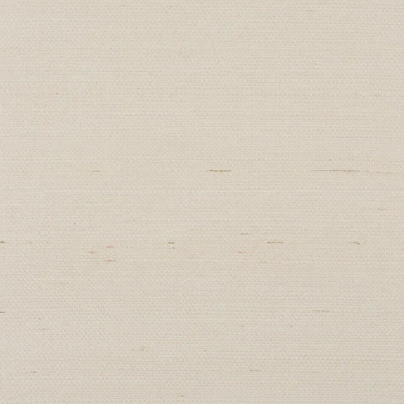
The PARCHMENT colorway offers a soft, light beige tone that shifts beautifully throughout the day. In natural daylight, it reads as a warm neutral with subtle variations, while evening lighting brings out a gentle sheen that emphasizes the wallpaper’s tactile texture. The finish adds depth and dimension, making it a sophisticated alternative to flat paint.
What you’re seeing
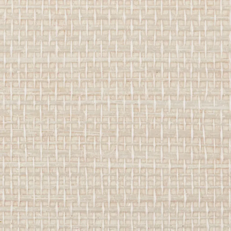
This wallpaper showcases a light beige textured surface marked by subtle horizontal streaks that mimic the appearance of woven sisal fabric. The texture is tactile yet refined, offering a natural fabric feel that complements a wide range of décor styles.
There are no metallic or embossed effects in this pattern; instead, its charm lies in the understated sheen and the natural irregularity of the woven look. The fine horizontal lines create a sense of movement and softness, while the neutral parchment tone ensures versatility and timeless appeal.
Material & specs
| Collection | PERFECT BASICS: HARUKI SISAL |
|---|---|
| Material | PAPER |
| Match | RANDOM |
| Roll width | 36.0 in |
| Roll length | 4 yards |
| Coverage | 72.0 sq ft |
Explore the detailed specifications and installation guidelines for HARUKI SISAL below.
Styling & pairings
- Pair with natural materials like rattan, jute, and linen to enhance the organic texture and feel.
- Warm metals such as brushed brass or antique gold highlight the wallpaper’s sheen without overpowering it.
- Use medium-toned woods like walnut or oak to create a balanced, inviting environment.
- Complement with soft, woven fabrics—think boucle or lightweight wool—to echo the wallpaper’s tactile quality.
- Choose muted, earthy paint colors for trim and ceilings to maintain a calm, harmonious palette.
- Incorporate warm, diffused lighting to accentuate the natural texture and subtle sheen.
Where it works
- Entryways and foyers, where its understated elegance sets a welcoming tone.
- Powder rooms, adding texture and warmth without overwhelming small spaces.
- Living rooms and lounges, providing a subtle backdrop that complements varied furnishings.
- Bedrooms, for a calming, serene atmosphere that encourages relaxation.
- Home offices, where its neutral tone and texture foster focus and understated style.
- Hallways and transitional spaces, giving continuity and tactile interest between rooms.
Related from WallpaperTwins
Call to action
Explore details and order samples at HARUKI SISAL on WallpaperTwins.com.