Schumacher
HARUKI SISAL – Schumacher Wallpaper
HARUKI SISAL – Schumacher Wallpaper
Design story
The HARUKI SISAL wallpaper by Schumacher brings a fresh, lively energy to interiors, inspired by timeless natural materials and modern sophistication. Its texture and color evoke a warm, inviting atmosphere that suits both contemporary and classic settings.
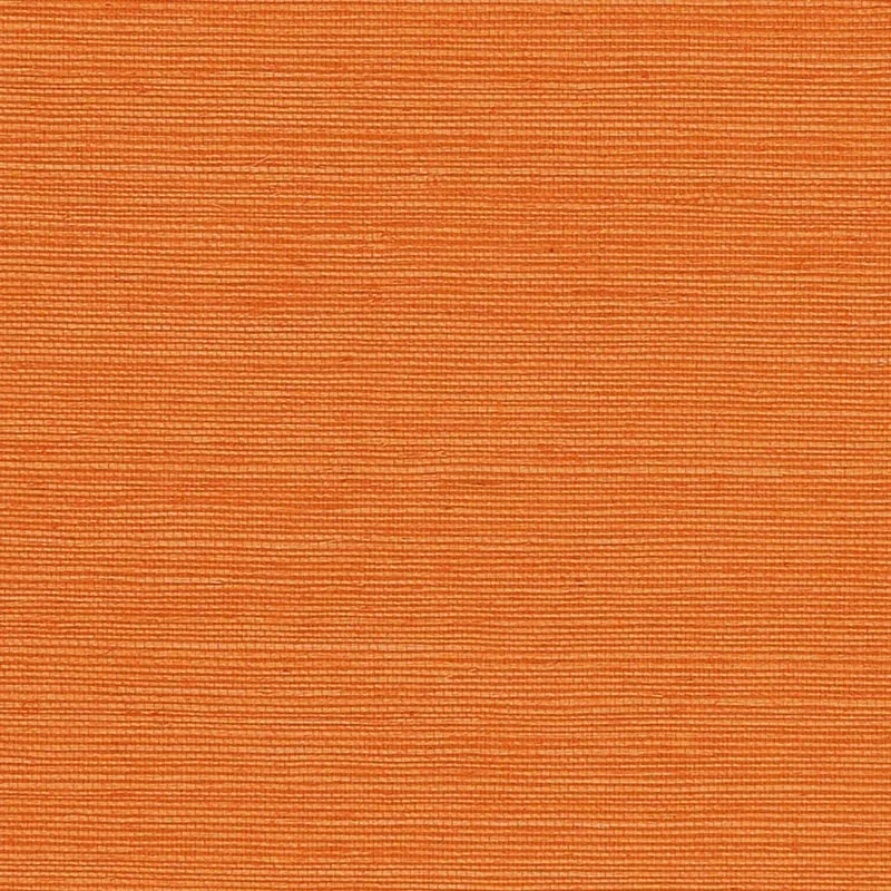
What makes this pattern truly beautiful is its subtle yet dynamic interplay of horizontal linear motifs that create a sense of movement while maintaining calm through balanced negative space. The delicate lines and structured texture offer a tactile experience that elevates any wall beyond a simple paint finish.
The Mandarin color shines brilliantly in natural daylight, intensifying its vibrant orange hue, while in evening light it takes on a softer, warmer glow. The wallpaper’s inherent sheen and textured surface catch and reflect light uniquely, adding depth and a sense of luxury to your space.
What you’re seeing
The HARUKI SISAL wallpaper features a finely textured surface reminiscent of classic sisal fibers, enhanced with a subtle horizontal linear pattern. The texture provides a tactile dimension that invites closer inspection, while the sleek sheen adds a refined finish. This design’s rich Mandarin color is bright and saturated, offering a vibrant yet sophisticated backdrop without overwhelming the senses.
Material & specs
| Collection | PERFECT BASICS: HARUKI SISAL |
|---|---|
| Material | PAPER |
| Match | RANDOM |
| Roll width | 36.0 in |
| Roll length | 4 yards |
| Coverage | 72.0 sq ft |
Below you will find all the essential details about the HARUKI SISAL wallpaper’s composition and specifications.
Styling & pairings
- Pair with natural wood tones such as light oak or walnut to complement the organic texture and warm hues.
- Incorporate matte gold or brushed brass metals for a subtle touch of glamour that enhances the wallpaper’s sheen.
- Choose linen or cotton fabrics with simple weaves to maintain a relaxed, textural contrast without competing with the wallcovering.
- Use soft, warm white paint colors on adjacent walls or trims to balance the bold orange and keep the space feeling open.
- Opt for warm, diffused lighting such as soft amber LED bulbs to highlight the wallpaper’s texture and rich color.
Where it works
- Powder rooms, where the wallpaper’s vibrant texture can create a memorable, intimate space.
- Entryways or foyers, offering a bold statement that sets the tone for the home.
- Dining nooks, where the warm Mandarin color encourages conviviality and warmth.
- Accent walls behind headboards, providing a textured focal point that adds depth and character.
- Home offices, where the wallpaper’s lively yet sophisticated pattern can inspire creativity without distraction.
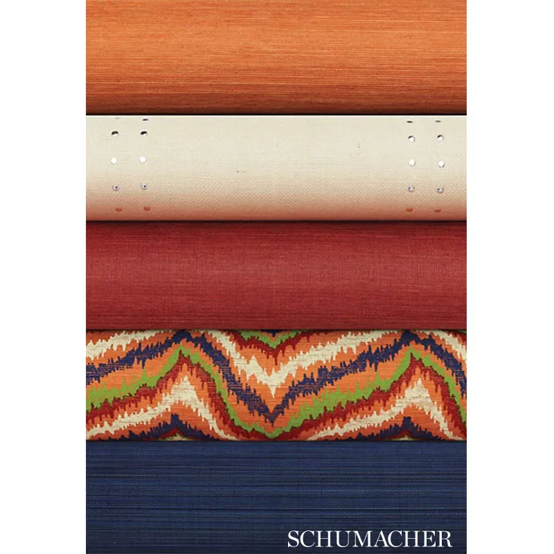
Related from WallpaperTwins
Call to action
Explore details and order samples at HARUKI SISAL on WallpaperTwins.com.