Schumacher
HARUKI SISAL – Schumacher Wallpaper
HARUKI SISAL – Schumacher Wallpaper
Design story
The HARUKI SISAL wallpaper by Schumacher channels a serene, natural aesthetic rooted in timeless sophistication. Inspired by the minimalist textures of woven fibers and earthy materials, it evokes a calm, grounded mood that fits effortlessly within both contemporary and classic interiors.
What makes this pattern truly beautiful is its subtle play of texture and line. The fine horizontal lines create a delicate woven effect that adds depth without overwhelming the senses. This restrained motif allows for generous negative space, offering a quiet movement across the wall that feels both organic and refined.
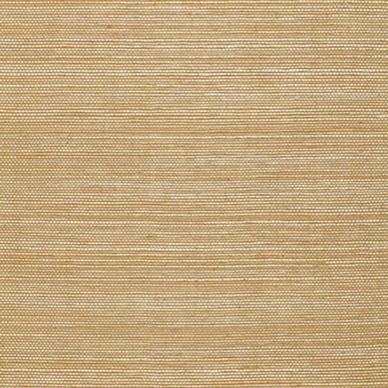
Rendered in the soft OATMEAL colorway, the wallpaper captures light beautifully throughout the day. In natural daylight, its warm beige tone reads as inviting and natural, while evening lighting brings out the slight sheen in the finish, highlighting the textural weave and giving the walls a gentle, tactile glow.
What you’re seeing
The wallpaper features a close-knit pattern of fine horizontal lines that mimic the look of woven sisal fibers. This texture is tactile yet subtle, providing a sophisticated alternative to plain painted walls. The finish has a gentle sheen that enhances the fabric-like quality without appearing metallic or glossy.
There are no embossed or metallic elements, keeping the focus on the natural, understated texture. The overall effect is a warm, neutral backdrop that suggests craftsmanship and natural materials, perfect for elevating any space with a hint of artisan character.
Material & specs
| Collection | ESSENTIAL |
|---|---|
| Material | PAPER |
| Match | RANDOM |
| Roll width | 36.0 in |
| Roll length | 4 yards |
| Coverage | 72.0 sq ft |
Below you will find detailed product specifications to help you understand the composition and installation requirements.
Styling & pairings
- Natural woods: Light oak or walnut complement the warm oatmeal tone and reinforce the organic feel.
- Matte metals: Brushed brass or aged bronze add subtle warmth without distracting from the texture.
- Fabric weaves: Linen or cotton upholstery in neutral shades enhance the tactile layering.
- Paint colors: Soft whites, warm greiges, or muted greens create harmonious schemes that highlight the wallpaper’s subtlety.
- Lighting: Soft, diffused lighting brings out the wallpaper’s sheen and texture, while avoiding harsh shadows that could disrupt the pattern’s calm effect.
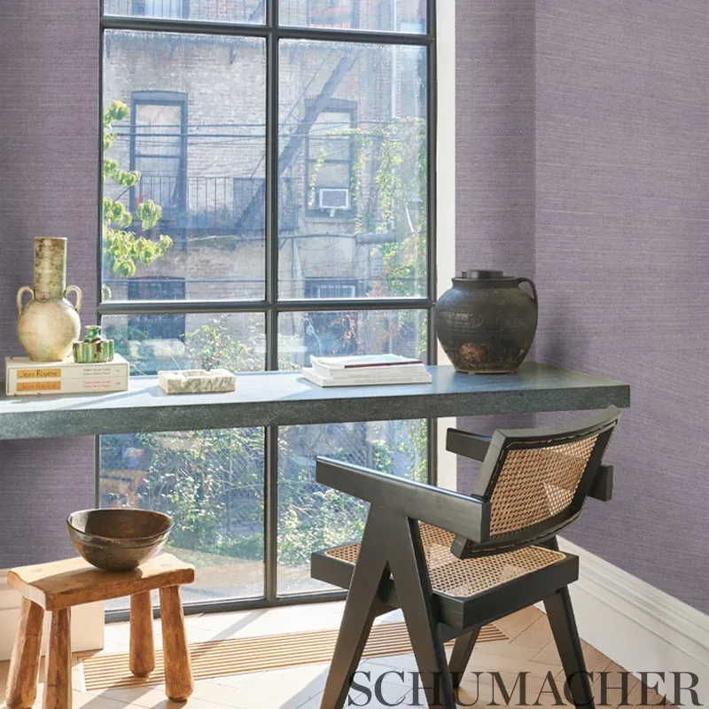
Where it works
- Powder rooms: Adds warmth and texture to small spaces without overwhelming.
- Entryways: Creates a welcoming, natural first impression.
- Dining rooms: Provides a subtle, sophisticated backdrop for gatherings.
- Bedrooms: Enhances a serene, restful atmosphere with soft tactile interest.
- Home offices: Offers a refined yet understated wall covering that encourages focus without distraction.
Related from WallpaperTwins
Call to action
Explore details and order samples at HARUKI SISAL on WallpaperTwins.com.