Schumacher
HARUKI SISAL – Schumacher Wallpaper
HARUKI SISAL – Schumacher Wallpaper
Design story
HARUKI SISAL by Schumacher Wallpaper draws inspiration from timeless natural textures, evoking a serene, modern lifestyle with a subtle nod to mid-century calm and contemporary minimalism. Its quiet elegance suits interiors seeking balance and understated sophistication.
What makes this wallpaper truly beautiful is its delicate horizontal stripe pattern, which gently plays with line and negative space. The fine, thin stripes create a sense of movement without overwhelming, while the fabric-like texture adds depth and tactility. Its scale is thoughtfully restrained, allowing the pattern to enhance a room’s character without competing with other design elements.
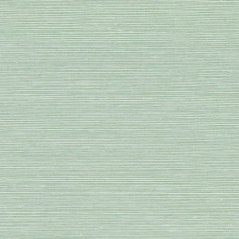
The Seaglass colorway presents a soft green hue that shifts gracefully under different lighting conditions. In natural daylight, the color reads as a fresh, airy green, while in the evening it deepens to a calming, muted tone. The wallpaper’s subtle sheen enhances the textured surface, catching light to create a dynamic but soothing ambiance throughout the day.
What you’re seeing
This wallpaper features a light green base punctuated by subtle horizontal thin stripes that resemble finely woven sisal fabric. The texture mimics a natural fiber weave, lending an organic, tactile feel to the surface. There are no metallic or embossed effects, but the sheen of the material lends a quiet luminosity that brings the pattern to life.
The overall effect is one of understated refinement—soft, yet structured. The horizontal stripes add a gentle rhythm that visually elongates walls, while the textured appearance provides a sophisticated alternative to plain paint or flat wallpaper.
Material & specs
| Collection | PERFECT BASICS: HARUKI SISAL |
|---|---|
| Material | PAPER |
| Match | RANDOM |
| Roll width | 36.0 in |
| Roll length | 4 yards |
| Coverage | 72.0 sq ft |
Below you will find detailed specifications for the HARUKI SISAL wallpaper in Seaglass.
Styling & pairings
- Natural woods: Light oak or ash complement the wallpaper’s organic texture and soft green tone beautifully.
- Matte metals: Brushed brass or aged bronze add warmth without overpowering the subtle pattern.
- Fabric weaves: Linen or cotton in neutral shades enhance the tactile quality and bring a relaxed, layered look.
- Paint directions: Pair with soft whites, muted greens, or pale greys for a harmonious, tranquil palette.
- Lighting: Soft, diffused lighting highlights the sheen and texture without creating harsh reflections.
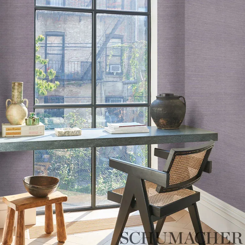
Where it works
- Powder rooms: Adds a touch of elegance and tactile interest to small spaces.
- Living rooms: Creates a serene backdrop that enhances natural light and furnishings.
- Bedrooms: Provides a calming atmosphere conducive to rest and relaxation.
- Home offices: Offers subtle texture that inspires focus without distraction.
- Hallways: Elevates transitional spaces with understated sophistication.
Related from WallpaperTwins
Call to action
Explore details and order samples at HARUKI SISAL on WallpaperTwins.com.