Schumacher
HARUKI SISAL – Schumacher Wallpaper
HARUKI SISAL – Schumacher Wallpaper
Design story
The HARUKI SISAL wallpaper by Schumacher evokes a serene, contemporary mood inspired by natural textures and timeless elegance. Its subtle woven pattern channels a refined, modern aesthetic that fits effortlessly into both minimalist and sophisticated interiors.
What makes this wallpaper truly beautiful is its delicate interplay of texture and pattern. The fine woven motif creates a gentle movement across the wall, with a balanced scale that offers visual interest without overwhelming a space. Clean lines and generous negative space contribute to a calm, tactile experience that elevates the room’s character.
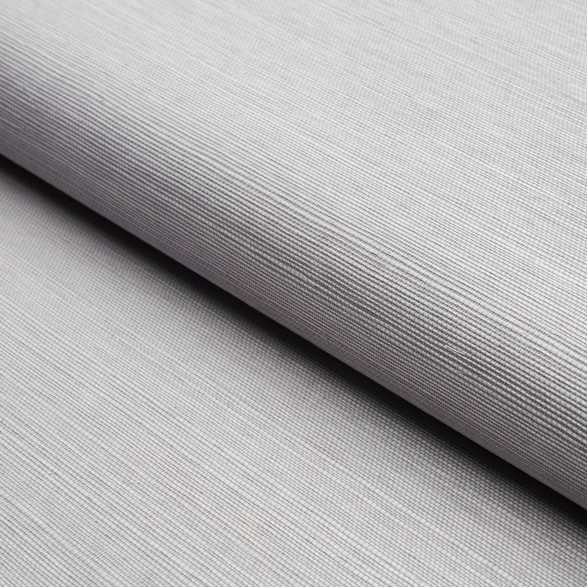
The Lavender colorway brings a soft, muted tone that shifts gracefully throughout the day. In natural daylight, it reads as a gentle, light gray with a hint of purple undertone, while evening lighting deepens its subtle warmth. The wallpaper’s inherent sheen enhances its texture, creating a sophisticated shimmer that plays beautifully with ambient light.
What you’re seeing
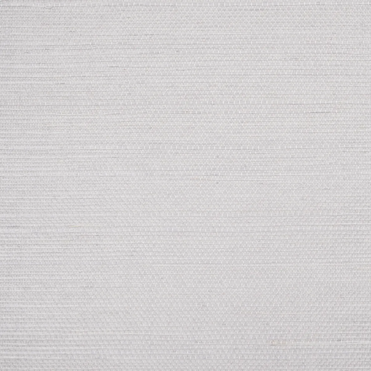
Visually, HARUKI SISAL features a close-up textured surface reminiscent of fine sisal fibers, woven into a delicate, repetitive pattern. The texture is tactile yet understated, offering depth without heavy embossing or metallic accents. This wallpaper’s surface has a soft sheen that catches light naturally, adding dimension and a modern refinement to your walls.
The pattern is precise and subtle, avoiding bold or busy designs in favor of quiet sophistication. Its woven appearance invites touch and adds a layer of interest beyond flat paint, making it a distinguished choice for those seeking understated luxury.
Material & specs
| Collection | ESSENTIAL |
|---|---|
| Material | PAPER |
| Match | RANDOM |
| Roll width | 36.0 in |
| Roll length | 4 yards |
| Coverage | 72.0 sq ft |
Below you will find the detailed specifications of HARUKI SISAL to help you understand its composition and installation requirements.
Styling & pairings
- Pair with natural woods like light oak or ash to highlight the wallpaper’s organic texture.
- Use brushed nickel or matte gold fixtures to complement the wallpaper’s soft sheen without overpowering it.
- Incorporate linen or cotton fabrics with subtle weaves for upholstery or drapery to echo the tactile quality.
- Choose muted, neutral paint colors such as soft taupe or warm greige to maintain a calming palette.
- Opt for layered lighting—soft sconces combined with recessed downlights—to enhance the wallpaper’s texture and sheen.
Where it works
- Perfect for powder rooms where a touch of elegance and texture creates a memorable impression.
- Ideal in entryways to provide a refined, welcoming atmosphere that sets the tone for the home.
- Works beautifully in dining nooks, where the subtle pattern adds warmth without distraction.
- Suitable for bedrooms seeking a serene backdrop that combines softness and sophistication.
- Excellent choice for home offices, adding tactile interest while maintaining a professional, understated style.
Related from WallpaperTwins
Call to action
Explore details and order samples at HARUKI SISAL on WallpaperTwins.com.