Schumacher
HAIKU SISAL – Schumacher Wallpaper
HAIKU SISAL – Schumacher Wallpaper
Design story
The Haiku Sisal wallpaper by Schumacher evokes a serene, timeless elegance influenced by natural textures and minimalist design. Its subtle linear pattern brings to mind quiet moments and calm atmospheres, perfect for those seeking a refined yet understated backdrop in their interiors.
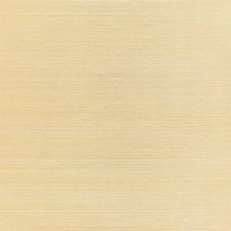
What makes Haiku Sisal truly beautiful is its delicate interplay of texture and line. The wallpaper features subtle horizontal stripes that create a soft, rhythmic movement across the surface. The scale is thoughtfully balanced, allowing the pattern to breathe with ample negative space, which enhances the overall sense of calm and sophistication.
The Citrine colorway lends a warm beige tone that shifts gently in different lighting conditions. In daylight, it reads as a soft, natural beige with hints of golden undertones, while in the evening, the warmth deepens, creating a cozy, inviting atmosphere. The wallpaper’s subtle sheen and textured finish catch the light in a way that accentuates its tactile quality without overwhelming the space.
What you’re seeing
The Haiku Sisal pattern presents a series of horizontal textured stripes, each varying slightly in width and depth, which together form a soft linear design. The texture mimics the natural weave of sisal fiber, adding an organic character to the wallpaper. There are no metallic or embossed elements; instead, the beauty lies in the tactile surface and understated pattern that invites closer inspection.
Material & specs
| Collection | PERFECT BASICS: HARUKI SISAL |
|---|---|
| Material | PAPER |
| Match | RANDOM |
| Roll width | 36.0 in |
| Roll length | 4 yards |
| Coverage | 72.0 sq ft |
Below you will find detailed material specifications to help you understand the quality and performance of Haiku Sisal wallpaper.
Styling & pairings
- Pair with natural wood tones such as light oak or walnut to enhance the earthy warmth of the Citrine color.
- Complement with brushed brass or matte gold fixtures for a subtle metallic accent that enriches the texture without competing.
- Use soft linen or cotton fabrics in neutral shades to maintain a calm, tactile layering in upholstery and drapery.
- Choose muted paint colors in warm greys or creamy whites to create a seamless transition between wall and wallpaper.
- Incorporate soft, diffused lighting such as frosted glass sconces or fabric-shaded lamps to highlight the wallpaper’s texture elegantly.
Where it works
- Powder rooms, where the subtle texture adds depth without overwhelming a small space.
- Entryways, creating a welcoming yet refined first impression.
- Dining nooks, offering a warm and inviting backdrop for intimate gatherings.
- Headboard walls, providing a soft, tactile frame that enhances bedroom comfort.
- Home offices, where its calm pattern promotes focus and serenity.
Related from WallpaperTwins
Call to action
Explore details and order samples at HAIKU SISAL on WallpaperTwins.com.