
Schumacher
FEATHERFEST – Schumacher Wallpaper
FEATHERFEST – Schumacher Wallpaper
Design story
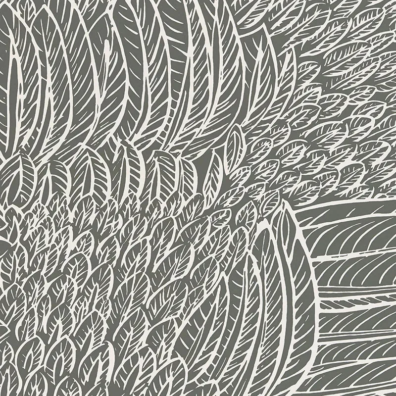
FEATHERFEST by Schumacher Wallpaper evokes a timeless elegance inspired by mid-century style and classic American sophistication. This pattern draws from an archival print beloved by Jacqueline Kennedy Onassis, bringing a refined, vintage mood into contemporary interiors.
What makes FEATHERFEST truly beautiful is its graphic play of stylized feathers, arranged in a rhythmic, overlapping composition. The hand-drawn quality of the feather shapes creates a dynamic sense of movement, while the scale balances boldness with subtlety. Ample negative space allows the design to breathe, emphasizing the fine line work and giving it a modern, airy feel.
The Slate color paletteis a nuanced range of grays and whites that shifts beautifully in different lighting conditions. By day, the soft shades present a cool, calming presence; by evening, the pattern takes on a deeper, more intimate character. The wallpaper’s finish enhances its subtle texture, catching light gently to add depth without overwhelming glare.
What you’re seeing
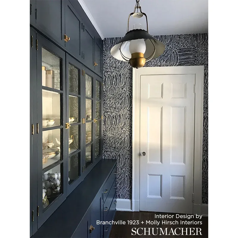
This wallpaper featureshand-drawn, overlapping feather shapesrendered in shades of gray and white. The design’s graphic quality is softened by the organic curvature of each feather, which creates a layered, textured effect reminiscent of natural plumage.
There are no metallic or embossed elements in this pattern; its impact comes from the interplay of line and contrast. The finish offers a slight sheen that accentuates the feather motifs without distracting from their intricate detail. The overall effect is modern yet grounded in traditional craftsmanship.
Material & specs
| Collection | DRAWN FROM NATURE |
|---|---|
| Material | PAPER |
| Pattern repeat | 25.25 in |
| Match | STRAIGHT |
| Roll width | 27.0 in |
| Roll length | 4.5 yards |
| Coverage | 60.75 sq ft |
Schumacher’s FEATHERFEST wallpaper is crafted with quality materials designed for durability and ease of installation.
Styling & pairings
- Pair withmatte black or brushed nickel fixturesto enhance the cool tones of the Slate palette.
- Incorporate natural woods likewalnut or ashto add warmth and balance the graphic design.
- Use soft, textured fabrics such aslinen or bouclein neutral shades to complement the wallpaper’s tactile appeal.
- Choosemuted gray or off-white paintson adjacent walls to maintain a cohesive, sophisticated look.
- Accent with minimalist lighting fixtures that providesoft, diffused illumination to highlight the pattern’s subtle texture.
Where it works
- Powder rooms, where the design creates an elegant, intimate atmosphere without overwhelming space.
- Entryways and foyers, offering a stylish first impression with its graphic yet timeless appeal.
- Dining nooks for a chic backdrop that adds interest without distracting from the table setting.
- Headboard walls in bedrooms, providing a textured focal point that complements soft bedding.
- Home offices or libraries, where the pattern can inspire creativity while maintaining a professional tone.
Related from WallpaperTwins
Call to action
Explore details and order samples at FEATHERFEST on WallpaperTwins.com.