Schumacher
DINA PAPERWEAVE – Schumacher Wallpaper
DINA PAPERWEAVE – Schumacher Wallpaper
Design story
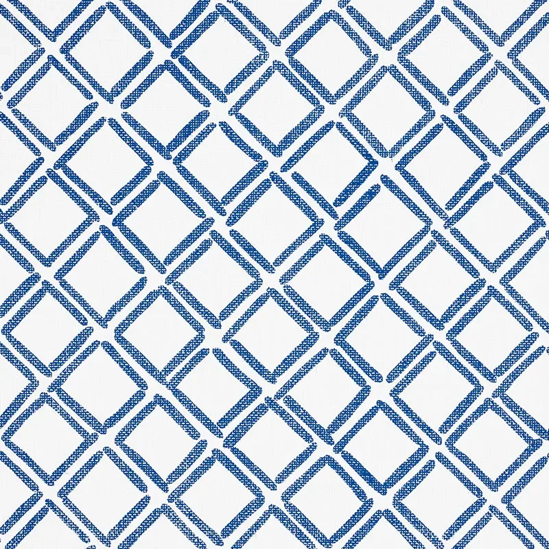
Dina Paperweave by Schumacher Wallpaper captures a fresh and cheerful spirit, perfect for modern interiors seeking a subtle nod to classic lattice designs. Its small-scale trellis pattern evokes a timeless yet contemporary mood, blending effortlessly into both casual and refined settings.
What makes Dina Paperweave truly beautiful is its painterly lattice motif, which features a unique diagonal grid composed of alternating solid and double lines. The pattern’s small scale and rhythmic repetition create a sense of gentle movement, while generous negative space ensures the design remains light and airy. The line quality feels hand-rendered, adding a charming, artisanal touch.
The cobalt blue palette reads vibrant and crisp in natural daylight, bringing a fresh pop of color without overwhelming the senses. In evening light, the blue deepens warmly, creating a cozy yet dynamic atmosphere. The subtle texture of the paperweave adds a soft sheen that interacts beautifully with light, enhancing the tactile quality of the wallpaper.
What you’re seeing
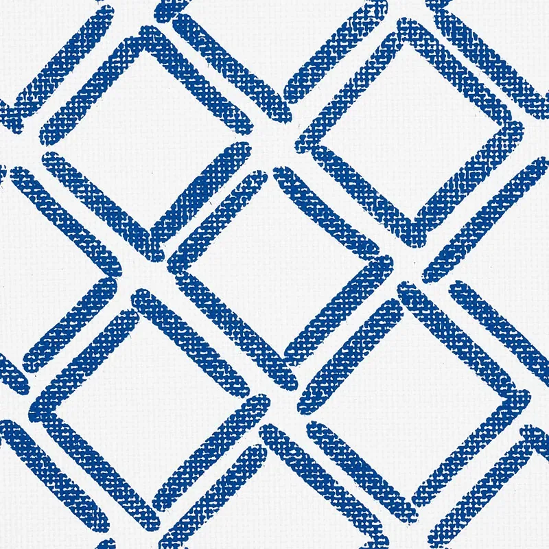
The wallpaper showcases a blue textured diagonal grid pattern set against a clean white background. The design alternates between solid and double lines, forming a geometric lattice that feels both structured and playful. This painterly grid is printed on a textured surface reminiscent of natural paperweave, giving the wallcovering a rich, tactile dimension.
There are no metallic or embossed effects, which keeps the focus on the interplay of color, line, and texture. The white ground provides a crisp contrast that highlights the blue pattern, making the wallpaper an ideal choice for adding modern depth to any room wall decor.
Material & specs
| Collection | TEXTURAL APPEAL |
|---|---|
| Material | PAPER |
| Pattern repeat | 17.0 in |
| Match | STRAIGHT |
| Roll width | 34.0 in |
| Roll length | 4 yards |
| Coverage | 68.0 sq ft |
Discover the detailed specifications and material qualities of Dina Paperweave below.
Styling & pairings
- Pair with natural wood tones like light oak or maple to enhance the wallpaper’s fresh and airy feel.
- Use brushed nickel or matte black metal accents for a contemporary edge without overpowering the pattern.
- Complement with linen or cotton fabrics in neutral shades to balance the bold cobalt color.
- Consider soft, woven textures such as boucle or subtle herringbone patterns to add depth without clashing.
- For paint, choose crisp whites or soft grays to maintain a light, open atmosphere.
- Incorporate warm, layered lighting—think dimmable sconces or pendant lights—to highlight the wallpaper’s texture and color shifts.
Where it works
- Powder rooms, where the small-scale pattern adds charm without overwhelming compact spaces.
- Entryways and hallways, creating an inviting and stylish first impression.
- Dining nooks, where the geometric design can energize and define the space.
- Bedrooms, especially as an accent wall behind a headboard for a modern yet cozy feel.
- Home offices, providing a fresh backdrop that encourages focus and creativity.
Related from WallpaperTwins
Call to action
Explore details and order samples at DINA PAPERWEAVE on WallpaperTwins.com.