Schumacher
CREEPING FERN – Schumacher Wallpaper
CREEPING FERN – Schumacher Wallpaper
Design story
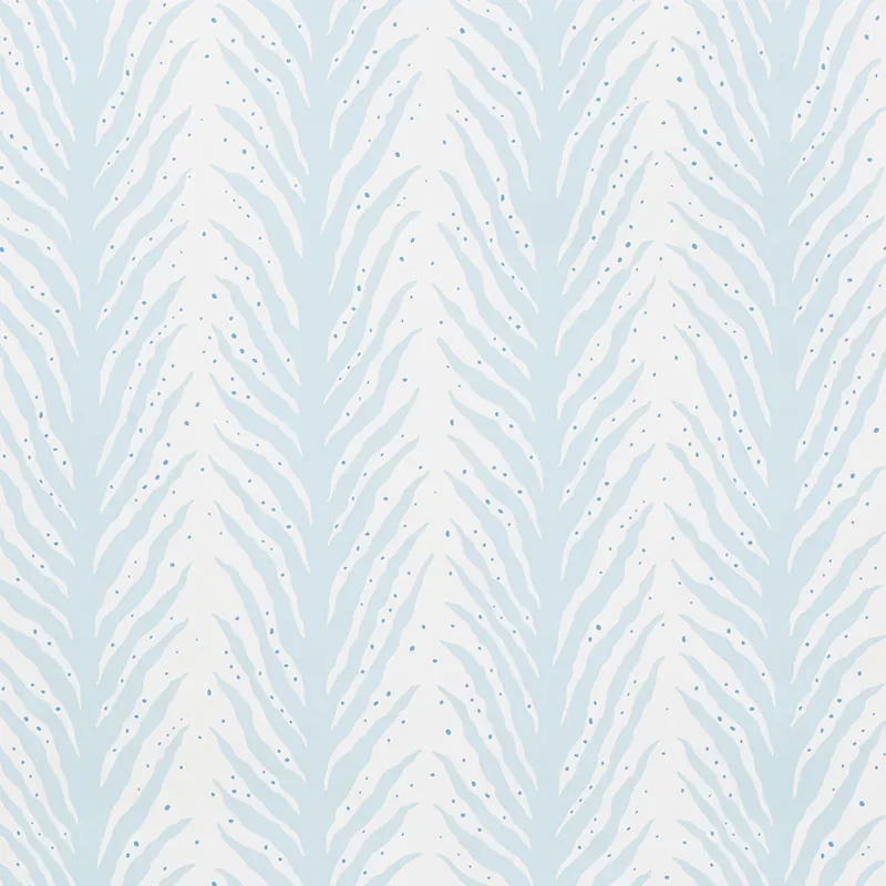
CREEPING FERN by Schumacher Wallpaper brings a refreshing blend of nature-inspired elegance and contemporary flair. Evoking moods of serene sophistication, this pattern fits effortlessly into modern and transitional interiors, drawing subtle influence from both natural history and abstract animal prints.
The wallpaper’s beauty lies in its unique interplay of motifs—a stripe that gently recalls both feathery fern fronds and a refined animal pattern. The movement is graceful yet dynamic, with delicate lines creating a rhythmic flow. Its scale balances boldness and subtlety, allowing negative space to breathe and enhance the design’s overall lightness and refinement.
Rendered in the calming Slumber Blue palette, the color shifts beautifully from bright daylight to soft evening hues. The matte finish reduces glare while the smooth texture softly reflects ambient light, adding depth without overpowering the room’s natural tones.
What you’re seeing
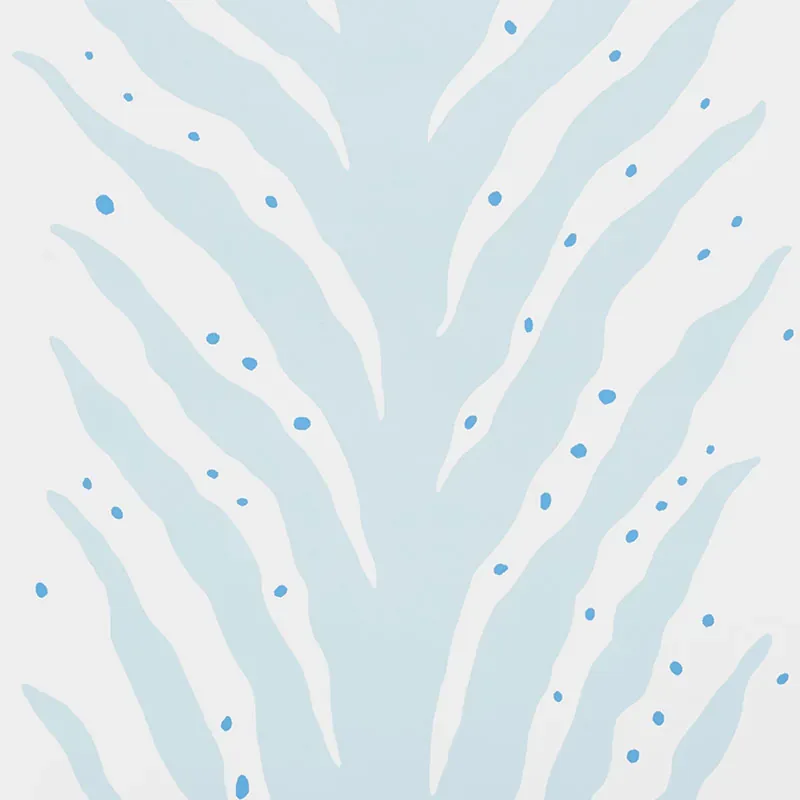
The visual experience of CREEPING FERN features a soft blue and white scheme, where a subtle zebra stripe pattern forms the foundation. The stripes are finely detailed with small scattered dots, creating a delicate dotted design that adds visual interest and texture. This screen-printed wallpaper offers a smooth surface with no metallic or embossed elements, emphasizing the pattern’s quiet sophistication and tactile simplicity.
Material & specs
| Collection | CELERIE KEMBLE |
|---|---|
| Material | PAPER |
| Pattern repeat | 25.375 in |
| Match | HALF DROP |
| Roll width | 27.0 in |
| Roll length | 4.5 yards |
| Coverage | 60.75 sq ft |
Below you will find the detailed specifications for CREEPING FERN wallpaper.
Styling & pairings
- Materials: Pair with natural linens and soft cottons to complement the wallpaper’s airy feel.
- Metals: Soft brushed nickel or matte brass fixtures enhance the subtle elegance without competing with the pattern.
- Woods: Light or medium oak finishes bring warmth and balance to the cool blue tones.
- Fabric weaves: Choose textured weaves like boucle or nubby wool for upholstery to add cozy tactile contrast.
- Paint directions: Soft off-whites or pale grays work well on adjacent walls, preserving the wallpaper’s calming presence.
- Lighting: Use diffused warm lighting to highlight the wallpaper’s gentle pattern without harsh shadows.
Where it works
- Powder rooms, where its delicate design offers a refreshing alternative to traditional prints.
- Entryways, creating an inviting and understated statement wall.
- Dining nooks, adding subtle texture and color without overwhelming the space.
- Headboard walls, providing a serene backdrop that complements bedding and soft furnishings.
- Home offices, where a calm yet inspiring environment is desired.
Related from WallpaperTwins
Call to action
Explore details and order samples at CREEPING FERN on WallpaperTwins.com.