BURNETT – Schumacher Wallpaper
Design story
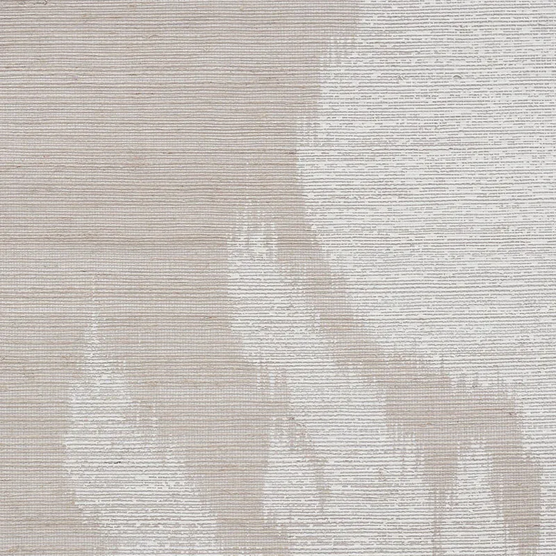
The BURNETT wallpaper by Schumacher captures a modern, artistic spirit that feels both contemporary and timeless. Inspired by the fluidity of watercolor paintings and abstract expressionism, it brings a calm, creative energy to any interior. This pattern is perfect for those seeking a subtle yet impactful statement that blends artful design with natural influences.
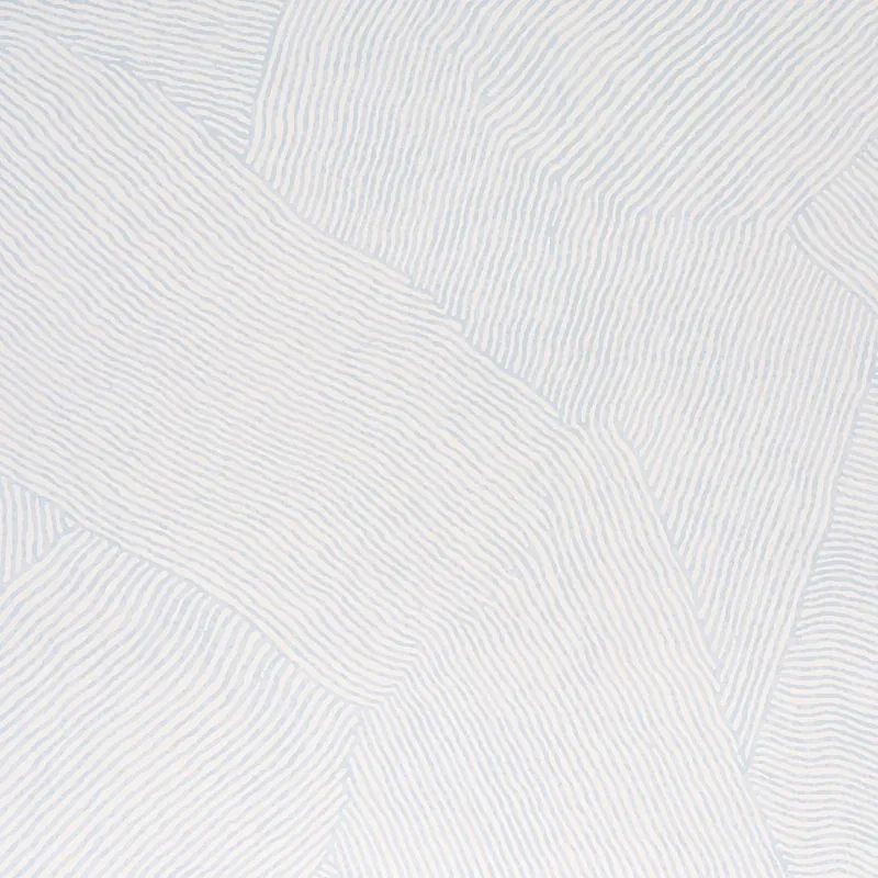
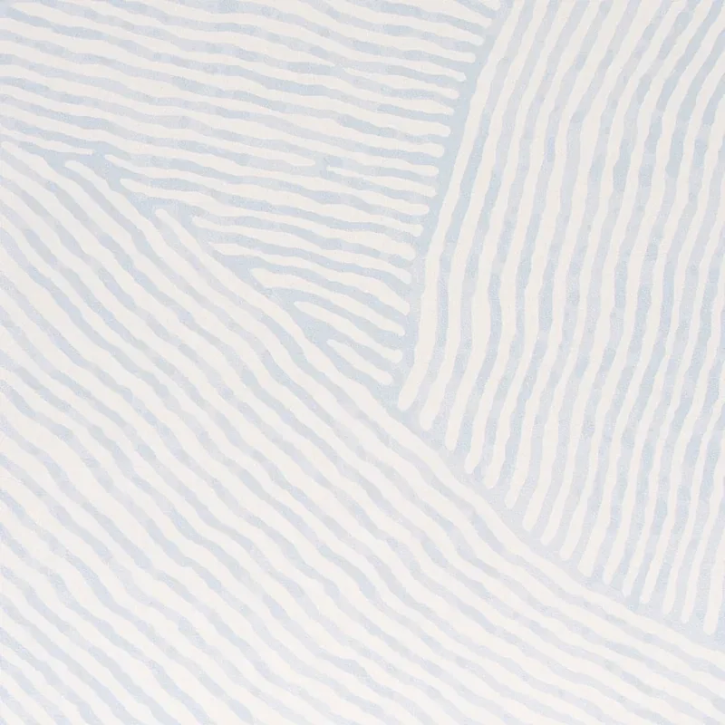
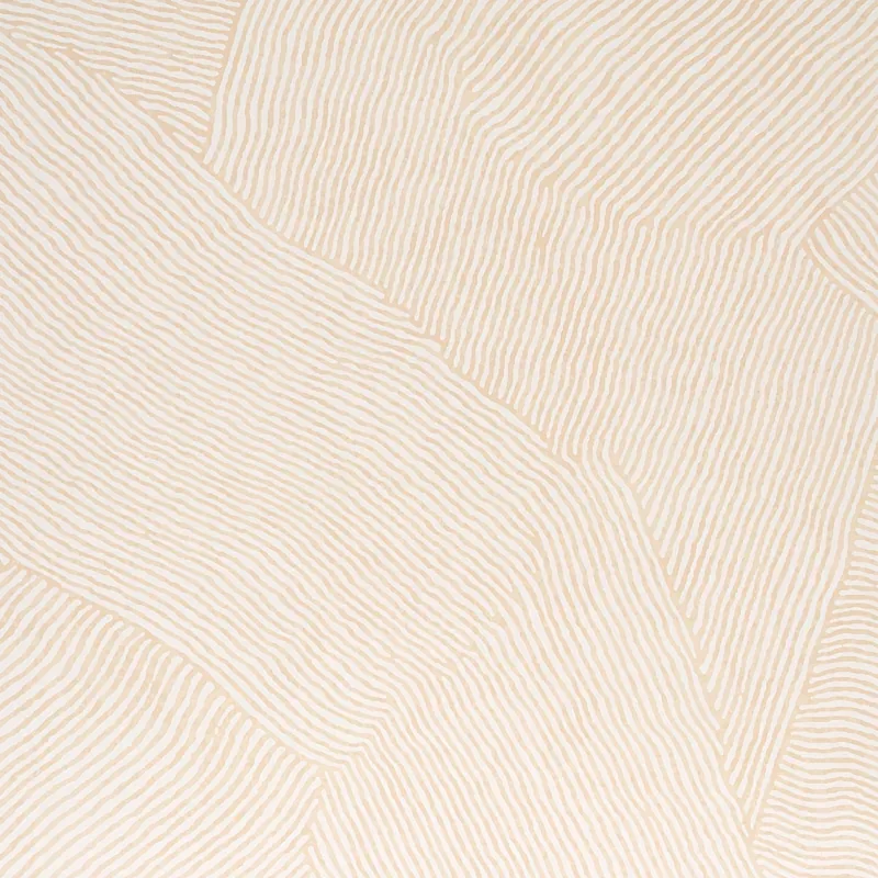
What makes BURNETT truly beautiful is its field of painterly brushstrokes that intersect to form an abstracted wave pattern. The design’s organic shapes and flowing lines create a sense of movement and rhythm, while the balance of negative space allows the pattern to breathe. The scale of the waves is thoughtfully considered, making it versatile enough for both accent walls and larger room applications.
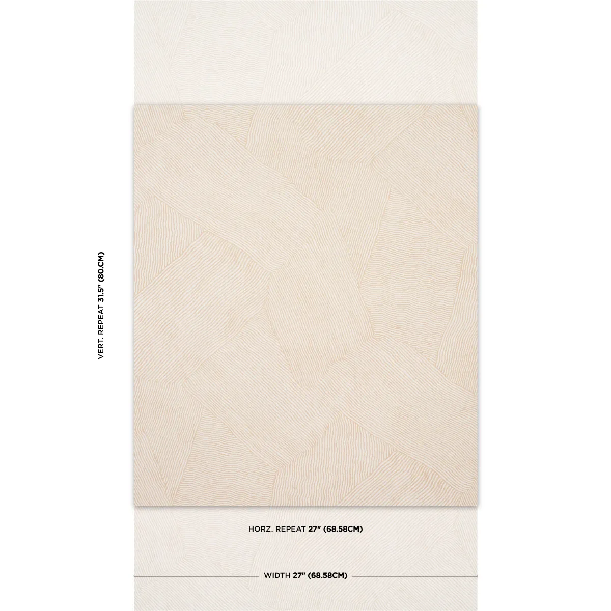
The Natural colorway emphasizes soft beige tones that shift warmly in daylight, evoking a serene, inviting ambiance. In the evening, its subtle sheen and textured surface catch gentle light, adding depth and a tactile quality that enhances the wallpaper’s watercolor effect. This nuanced interplay of light and shadow makes BURNETT a dynamic choice for interiors that change mood throughout the day.
What you’re seeing
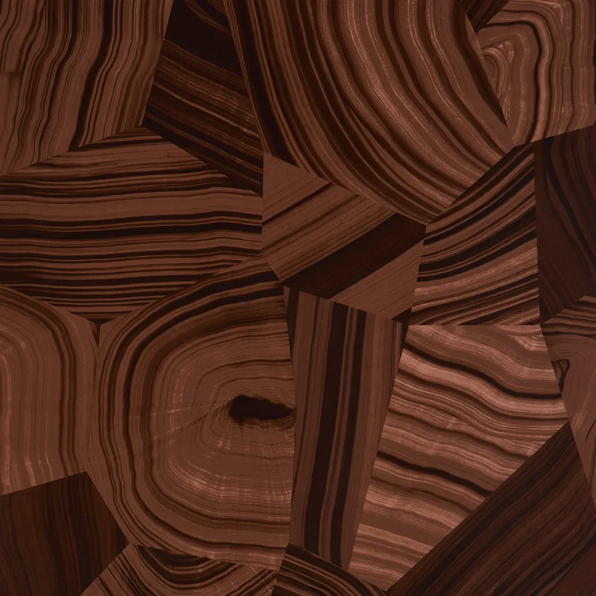
BURNETT features an abstract wave pattern composed of delicate, wavy lines that create organic, flowing shapes. The wallpaper’s surface has a subtle texture that mimics the brushstrokes of a watercolor painting, adding a tactile dimension to the visual design. The beige tones are soft and natural, reinforcing the pattern’s understated elegance. There are no metallic or embossed effects present, allowing the focus to remain on the beautiful interplay of line and texture.
Material & specs
| Collection | NATURA |
|---|---|
| Material | UNCOATED NON-WOVEN |
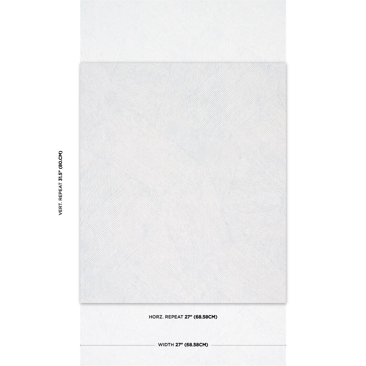
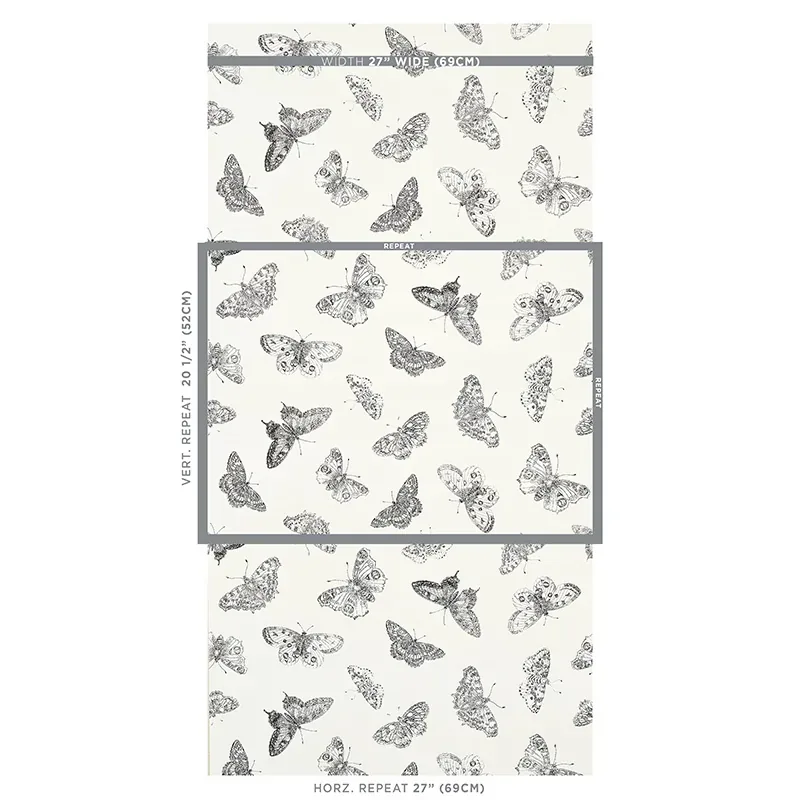
| Pattern repeat | 31.5 in |
| Match | STRAIGHT |
| Roll width | 27.0 in |
| Roll length | 10 yards |
| Coverage | 67.5 sq ft |
Below you will find detailed information about the material composition and technical specifications of the BURNETT wallpaper.
Styling & pairings
- Combine with warm, natural wood finishes like oak or walnut to enhance the organic feel.
- Use brushed brass or matte gold hardware and light fixtures for a subtle touch of warmth and sophistication.
- Pair with soft, textured fabrics such as linen or cotton in neutral or earth tones to complement the wallpaper’s natural palette.
- Complement with muted, matte paint colors like soft greys, warm whites, or sandy beiges to maintain a calming, cohesive look.
- Incorporate layered lighting—soft ambient lights with directional accents—to highlight the wallpaper’s texture and shifting tones throughout the day.
Where it works
- Powder rooms, where its subtle pattern can add interest without overwhelming small spaces.
- Entryways or foyers, creating a welcoming atmosphere with artistic yet understated elegance.
- Dining nooks, where the soft waves and warm tones encourage relaxed, intimate gatherings.
- Headboard walls in bedrooms, providing a serene backdrop that enhances restfulness and style.
- Home offices or creative spaces, inspiring calm focus with its abstract, flowing design.
Related from WallpaperTwins
Call to action
Explore details and order samples at BURNETT on WallpaperTwins.com.